Warning: The following list may be upsetting to people suffering from Smurfophobia, hipsterism, marveltardia, mangaplasmobia or marxismus. If you suffer butthurt after reading (or skimming through) this post, consult your physician or psychiatrist.
There are thousands of average and mediocre cartoonists, and hundreds of good cartoonists. But, as in everything, the truly great ones are rare; there are probably no more than 100 of them. I am sick and tired of mediocrities and even hacks being hailed as "greats" on various best-of lists compiled by people equipped with zero sense of aesthetics and even less knowledge of the vast world of comics, which spans over a century - rather than just 1995-2020. Collecting Marvel and DC comics doesn't make you an expert on anything - except cheesy superheroes dressed as clowns. Anyone who limits themselves to just superhero nonsense can't really call themselves a true comic-book fan. It'd be like MTV devotees glued to chart-pop calling themselves "music fans". Listening to just one very narrow branch of music (and a shit one at that), or focusing only on one specialized type of comic-book (and a shit one at that) simply isn't enough.
This is a list of the greatest illustrators, a list that takes into consideration all eras and all regions; not just the 21st century and not just the US of A - and certainly not just superhero cartoonists. I do not claim to be acquainted with the entire world of comic-books, because nobody is, but I do know a lot more than the average millennial Joe Schmoe who thinks he is qualified to rank "the greatest", based simply on his meager 5-year experience of following the kitschy adventures of Batman, Iron Man and whatever stupidly drawn manga hero he follows religiously.
No, not "graphic novels". They are comics, or comic-books. "Graphic novel" sounds too pompous, and it's a completely needless addition to the existing labels. Saying "graphic novel" makes one appear insecure about being a comic-book fan, as if one is trying to "lend respect" to something that is generally underestimated and underrated. Besides, it's semantically fallacious: because they're not novels. A novel by definition isn't graphic in nature, so whichever bird-brained hipster came up with this dumb label can certainly shove it right back up his non-virginal ass; I don't use it ever - except mockingly, i.e. to shit on it, and then flush it down the sewer where it belongs, along with all the hipster comic-books for which this label is generously applied.
Americans may have invented that dumb label, and we know that they focus a lot more on Marvel/DC. In fact, that's all they focus on. (OK, there's Dark Horse too and the like... They are better, but hardly a beacon of artistic supremacy.) Perhaps it wasn't a hipster who invented the term "graphic novel". Maybe it was the opposite: some chip-on-shoulder Batman fan who wanted to forcibly lend a level of "respectability" to his superhero's empty-headed adventures. I can certainly understand why superhero fans would have a chip on their shoulders... They'd better!
Saying "graphic novel" is like calling a black person “African-American” (despite the fact that not all
black people stem from Africa, despite the fact that some indigenous
Africans are Arabs, and despite the fact that most American blacks have
never even been to Africa - or that some can't locate it on a map), but even dumber
because comic-books
don’t have “feelings” and won’t ever be upset by how you call them, not
even if
you refer to them as “infantile reading material for retards that don’t
have either
the attention-span or the intellectual capacity to move on to books”.
Which is of course not true...
Am I a retard? You be the judge. Read the list and decide. (Spoiler: if you are a retard then you'll probably conclude that I'm one too. So ironic...) Or don't read anything, just watch the nice shiny panels.
I became an avid comic-book reader from roughly the age of 5, and a dedicated collector since the age of 9 or 10, but for many years after I hit 15 I only very rarely read any. When I turned 15, movies, music and tennis came to the forefront, and comics took a backseat. This went on for 20 years or more, but relatively recently I went back to my first childhood hobby. (No, not nose-picking. I mean comics of course.)
Nostalgia is a bitch! It's a big old manipulator, and part of the proof that there can't be Free Will. A few years ago (2013, when the original version of this list was put together and posted on a different blog) I started looking back at the tons of
stuff I
used to collect and read, back in the day when nose-picking was a way of
life,
not just a paper-tissue-substitute. (Only a few of my comics are
booger-stained,
thank you
very much; I may be a messy person, but I've always looked out after my
collections. They were my babies; babies full of ladies with bare
breasts but
very few actual babies).
As
a comic-book-obsessed kid, it was always essential to
me that the illustrations are
excellent, or at least decent, otherwise I
wouldn’t
go near the comic. I was anal about the quality of the drawing back then and I still am. The story was/is important, sure, but a good story
with
lousy or mediocre illustrations? Forget it, not interested. I’d much rather
have superb drawing with a shitty story than vice versa, if given a
choice between the two extremes.
I decided to do this list for several reasons – because all
complex and intelligent people nearly always do brilliant things for multiple reasons,
right?
1. I thought it’d be fun to place nice-looking drawings
on a blog, something I rarely get to do. (Picasso's ugly shit doesn't count as nice.)
2.
Just out of curiosity, I had checked out other best-of lists
on the net, and realized quickly that other comic-book fans are truly clueless, the vast majority of them, even the "experts". It’s usually Americans who post those laughable lists, and
- very predictably - their sole focus is on daft superhero comics, which I had outgrown
when I was 8. Yes, even as a little imbecile I was at least smart enough
to say “screw this; the kryptonite accountant, the two-legged spider and the bat impersonator are way too dumb
for me, I need to move on to something more interesting, less
predictable and with better drawing”. Fortunately, growing up in 70s/80s Europe, there were many weekly/monthly magazines that featured non-American comics, proving that alternatives to the US mainstream were/are plentiful. Consider the fact that most comic-book-reading
adults still focus just on superhero nonsense, without even having the slightest awareness of
the
excellent stuff that’s out there. That's because they're nerds and buffoons and nerds/buffoons
rarely have good taste, in anything.
3. It gave me an opportunity to annoy fans of those cretinous American superhero comics. If I annoy just ten of them, this goal will be met.
4. It gave me yet another excuse/opportunity to mock hipsters and Commies, my favourite targets.
5. It gave me an excuse to finally write about Smurfs.
The criteria used for judging visual quality and style, in no particular order:
1. Originality. If a style is instantly recognizable (in a good way) that's a bonus right there.
2. Use of colour (if any). Some comics look much weaker in b&w, but I judge those only at their best - i.e. in colour. Because some styles were intended for colour, hence when they are released in b&w they are in a sense incomplete. Like releasing a movie without its soundtrack.
3. Fluidity of lines. (I don't know what else to call it, but I know what it means, hope you do as well).
4. Facial expressiveness
i.e. the ability to inject life into the characters; the skills needed to
accurately and above all stylishly draw faces and convey emotions. One of the rarest skills.
5. Scenery. The ability to draw landscapes, backgrounds, backdrops in a way that enriches the pages and gives them more depth. Lots of empty white spaces are definitely a big minus.
6. Precision. Obviously, some techniques require precision (much) more than others.
7. Consistency and discipline. Both micro-consistency (panel to panel, page to page), and macro-consistency (career span).
8. Body of work. Obviously, one terrifically illustrated 10-page story is less worth than 1000 very-well drawn pages.
9. Influence. This is the least relevant factor, however, because an average talent can be influential simply by chance. Sort of the way the Rolling Stones were highly influential despite writing such mediocre music.
10. Nostalgia
factor. I'd be lying if I told you that subjectivity doesn't influence
the order at least somewhat. But I've tried my best to be as objective
as possible, giving illustrators I'd only recently discovered the same
consideration as those I'd read as a kid. Proof of my objectivity is the fact that several illustrators I had never read as a kid - that I only started reading relatively recently - I placed in the top 10.
Basically:
The cartoonists were/are chosen purely based on the quality of the
drawing/art, hence the illustrators are ranked based only on this; the
quality of the stories isn't taken into account.
There are nevertheless many well-written albums/serials included (or mentioned), so I occasionally talk about that too. It's just that the writing
is not what the list is about primarily. It isn't a Greatest Comics Ever
list (although it does come close to being one simply by default) which would take into
account both the art and the scripts. It is a list of the best
illustrators. The order is fairly intentional and relatively precise.
Note: This list was posted on a different blog in 2013 as a top 30 list. It was expanded to 50 in 2020 for this new blog. In 2022 it was expanded to 100. The link for part 1 is here:
New: Best 100 Comic-Book Illustrators - Part 1
Best Comic-Book Illustrators
Of All Time (Part 2):
50-1
50. Gianni de Luca - Italian
 |
| A splash page from Hamlet. Really impressive. (I'm a sucker for dots. Dots, dots, and more dots. Can't ever have too many dots.) The hipster language & why I never use it: Yup, I'm totally unpretentious. If I like dots, I'll say it - and in plain English. Unlike hipsters who write art/comics blogs. They'd feel too embarrassed to express themselves in such simple ways, it would be beneath them to do so. This is how an empty-headed, chip-on-shoulder hipster might word his love of dots: "Luca expresses the alienating horror of medieval urban decay by juxtaposing characters depicted through linear artistry with large, eclectic objects illustrated in a far more abrupt manner whereby the whole is composed of smaller elements as opposed to longer strokes that his characters enjoy." Yeah, I could never write like that. Because that would be beneath me. (Besides, I'd be laughing too hard to be able to get anything done.) Learning to use this "hipster language" (used by way too many buffoonish music/art critics) isn't difficult: you don't need brains for it nor even advanced linguistic skills, you only need a huge inferiority complex as a motivator. Because hipsters crave attention, love and respect, above all. Especially respect - because they don't respect themselves enough. (People with low self-esteem are much more likely to constantly whine about getting no respect.) Mark Twain used to make fun of bad writers (such as Fenimore Cooper whose Mohicans garbage he mercilessly trashed in a hilarious essay) and especially their propensity to complicate language for the sole purpose of showing off. Language is first-and-foremost a communication device, and only assholes veil their ideas and messages to the reader in a way that is roundabout, muddled and excessively fancy. You wanna be mysterious, fancy? Write poetry for like-minded assholes. When you write essays/texts, try to be friggin' direct and concise. You don't have to be a robot about it, but try to make your reader understand what you are trying to convey, because that is far more important than feeding your insecure, bloated Ego by raping the thesaurus every 5 minutes... |
 |
| From what I can gather, a bunch of such spectacular spreads are to be found in Romeo & Juliet, shown above. It's a bit of a pity that he "wasted" some of his best drawings on a story as milked-dry as Shakespeare's boohoohoey, melodramatic, teenie-love play. The only good thing about R&J is that it's set in the distant past hence allowed Luca to depict more "exotic" backdrops. Btw, he'd briefly studied Architecture, which might explain his top-notch depiction of edifices - and just exteriors in general. |
 |
| A rather stylish, accurate depiction of French actor Piccoli. From Il segreto dell'isola, one of the more commercial ventures. If only all commercial comics looked this good... |
 |
| From the unfinished album, The Days of the Empire, set in imperial Rome. Quite different stylistically, showing impressive versatility. I prefer the older stuff though. |
 |
| It's rather unusual for an Italian cartoonist to do so many non-commercial, historical, literature-based, "arty" comics. The majority of them do only Disney fumetti, cheesy Bonelli westerns/heroes or some corny crime series. A few other exceptions are Pratt and Manara, obviously. Still, one can say this about most countries which harbour a large number of talented illustrators: commercial pressures force most of them to waste their time and energy on inferior crap. It's tough to make a living from comics hence beggars can't be choosers. Speaking of the devil, Luca did one of those too: Commissario Spado, a detective series, shown above, what he's (unsurprisingly) best-known for in fact. Yet it's supposedly more intelligently scripted than the usual whodunit pulp. I wouldn't know: never read any of Luca's comics. Yet another great from the past whose comics are very hard to come by - perhaps even in Italy itself. The drawing in Spado is somewhat reminiscent of Poivet. |
49. François Bourgeon - French
 |
| It takes a while to get used to Bourgeon's imperfect and rather weird portrayal of faces, but once you do, you notice just how brilliantly he illustrates scenery of any kind. This is especially obvious in Cyann (shown above) and Companions of the Dusk. The latter consists of three albums, the drawing improving gradually, reaching its pinnacle in the last album in which the backgrounds are sometimes astounding, especially the longshots. Unfortunately, as the drawing improves so the story disintegrates. It is an offbeat, somewhat muddled medieval fantasy tale that I would recommend to any serious comic-book fan (i.e. not to marvelistas or teeny-bopping mangatards) despite its shortcomings in the story department. The first album is comprehensible, the second one becomes a little messy but still makes sense mostly, but it's the third and final (and longest) installment that becomes far too confusing and narratively undisciplined: too many new characters are introduced, too many sub-plots, and the transitions are clunky instead of smooth. The basic plot is mostly placed on the back-burner in favour of introducing new ideas that Bourgeon wanted to suddenly focus on, such as anti-semitism. This 3rd album isn't boring by any means but expect to get confused, very confused. |
 |
| Speaking of political themes, his most famous serial is Passengers of the Wind. It is illustrated in the somewhat simpler style of the first two albums of Companions of the Dusk (2nd album, shown above) but unfortunately doesn't focus on fantasy: it is an 18th-century adventure drama awash with feminist and anti-racist moralizing which is why I've avoided it so far. That's why I can't tell you to what extent it is PC, and whether the story is any good. Bourgeon mostly writes all his own stuff. His 80s/90s comics are a great example of how well colour used to be handled, before computers destroyed comics. Which brings me to why I have very little interest in modern comics. (Read: comics crapped out in this century.) Not only are they artistically inferior because much uglier than those of the golden period (50s-90s), not only are they more generic and samey, but the worst aspect might be the bloody awful "CGI" colouring applied to the vast majority of them. Even those old 25-page superhero Marvel/DC comics from the 60s and 70s had a certain charm to them because they were presented in natural colours - and suitably inferior paper. But because philistine swine make all the decisions for us in this Age of Paris Hilton, even vintage comics are now getting re-coloured i.e. ruined, re-released in inferior quality, and on glitzy high-quality paper which only serves to expose its weaknesses more. (This thing about weaknesses is specifically a reference to Marvel/DC comics, which look a lot better in original colouring and the old toilet-paper they used to be printed on.) Modern colouring is making comics look artificial and plastic i.e. like computer games, which of course pleases gamers and other mega-nerds. These younger generations of comic fans want everything to look like computer games: movies, comics, CD album covers, their girlfriends, you name it. If it's plastic-looking, they like it. Various branches of the entertainment industry had created these clueless zombies (weening them on garbage from a very young age) and now they cater to their zombie tastes by making everything look sterile. Because young comic-book fans have no taste and no criteria, the rest of us have to suffer for it. (Pretty much similar to the situation in popular music, and movies.) In other words, I don't expect these peasant millennials to reverse this trend: they are so blissfully uncritical and easily manipulated, happily ready to embrace any fad, just as long as it's a fad heavily hyped by the political/cultural Establishment (which they unquestioningly obey). Quite to the contrary: they've grown up in a cultural vacuum, bombarded by Dreck since birth, hence their sense of aesthetics is heavily impaired. That generation will only breed even more plebeians, and so the devolution of art could continue indefinitely. It's a vicious cycle, with no hope yet on the horizon. Another reason why I dislike 21st-century comics is unrelated to the art itself. It's the political correctness that has infected a large bulk of the stories and characters. But I discuss that sufficiently elsewhere. |
48. Enric Sio - Spanish
 |
| In terms of layout this guy was always quite interesting, and perhaps even a little ahead of his time. |
 |
| He doesn't have consistency as great as some others on this list, but every now and then you are confronted with a drawing of a face or a female body, and you're struck by how good it is. The scenery is often spectacular, too. |
47. Pierre Culliford aka Peyo - Belgian
 |
| Ha! After quite a few "serious", renowned illustrators, here's one for all the comic-book hipsters out there. (Is there such a thing as comic-book hipsters?) I was obsessed with the Smurfs during a relatively short period when I was around 11. Their comics were very hard to come by, so I had to motivate my friends to find Smurf pages wherever they could and I'd buy them off. I think it's fair to say that could be classified as "obsession". But I was only interested in the comics by Peyo. The retarded-looking TV kiddie cartoons did not interest me; everything Smurf-related outside of Peyo's comics stank back then and still stinks. Except the little figurines. I had a bunch of those. Still do. |
 |
| Back then it didn't really strike me as particularly unusual that 100 blue males would live together with just one female (or in fact no females until she arrived in the village). Do they take turns? However, Peyo showed on several occasions that all Smurfs (except the intellectual one and the old geezer) lusted after Smurfette (with their tiny blue penises?) so that was all I needed not to be turned off. Nowadays, the Smurfs are probably all gay, so I do pity the current generation of kids for being brainwashed with LGBT propaganda at every corner - being carefully groomed for pedos. I wouldn't be surprised if Smurfette were now butch, screaming "girl power" every 5 seconds and was undergoing a sex-change in one of the more recent episodes. She will probably take a machine-gun to kill a bunch of "Fascists" i.e. pro-Trump protestors in one of the next episodes... Peyo's drawings may look primitive (to people with no aesthetic sense), but they're anything but. The technique is clean yet somewhat fluid, precise and expressive (and by that I mean the little blue faces). Absolutely nobody can draw the little f**kers as well as he does, and if all smurfs - Peyo and non-Peyo ones - look alike to you, then you're comic-book-blind. It's as simple as that. Sort of like being tone-deaf hence unable to hear the difference between garbage (Bon Jovi) and genius (Killing Joke). |
 |
| How the current "anti-racism" witch-hunt craze is affecting even innocent comics: I can't not mention the laughable controversy surrounding the Black Smurf episode. I believe you can guess which of these covers is the original... Right? You can also easily guess what this is all about... Right? Well, in case you can't: some American SJW idiot must have thought that Peyo is a racist, or that his comic could be taken to be anti-black, and so to "spare" the Smurfs franchise embarrassment and image damage, an easily-intimidated (or simply overly cautious/dim-witted) publisher called Papercu(n)tz cow-towed to the pressures of rabid, insane snowflakes to change not only the title, but to actually re-colour all the black Smurfs and change the words from "black" to "purple". This was done for the American market, in 2010. We know this move was idiotic and unnecessary, brought about by the toxic, maniacal climate of Cultural Marxism which has been holding the West hostage since the 90s. But just how idiotic is it? Much more than you think. 1. The original episode came out in 1963, i.e. not that long ago. If this story had been released in for example 1928 then maybe the Antifa brigade would have a case. Barely. 2. The plot is about a black fly (not a black person) that bites a Smurf, infects him, reduces his vocabulary to just one word, and changes his colour to black. This Smurf becomes instantly rabid, violent and insane, hellbent on biting hence infecting other Smurfs. In other words - he becomes very much just like a fanatical American activist! The IRONY here is immense, because the story has far more parallels with deranged left-wing political correctness than black people being violent morons - which is basically what SJWs think it's about. American activists: deranged, violent zombies, reduced to just one word ("Racist!!!"), seeking to infect everyone else with their mental disease. The similarities are striking: they make this whole controversy profound almost. 3. This lunacy proves without a smidgen of a doubt that it's the do-gooder liberals that are the true racists. They are projecting their own notion of blacks being violent, insane morons onto everything. They believe that blacks are violent morons hence that is exactly what they find everywhere: whether it's there or not. 4. Which is why the all-encompassing "anti-racist" witch-hunt which dominates all the media and culture since 20 years had spread to the innocent world of children's comic-books too. 5. Black people don't seem to be complaining. SJW buffoons, however, don't give them enough credit - because, as I said, SJW "progressives" are latent racists who treat blacks as inferior children needing constant attention and "protection". But protection from what? Smurfy propaganda? 6. The colour black symbolizes evil in story-telling, it has nothing to do with race - or at least not only race. Colours are not primarily race-related. When someone says "yellow" I do not think of the Chinese. Perhaps libtards do, but that's because they are latent racists obsessed with anti-racism. (Yes, they are insane hypocrites.) Besides, purple and blue are too similar: i.e. what a dumb choice. The censors could have picked red instead... No wait, they couldn't... That could be perceived as anti-Indian. Sorry, "Native American". A question: what if there were races for each colour? What if there were green, blue - and purple - people? Well, in that case any colour Peyo would have chosen for the infected Smurfs would have had the imaginary burden of a potential racial subtext. Hence it would be impossible for him to do a story with this plot - without getting in trouble with all those mentally ill regressives posing as progressives. Fortunately, only Americans were stupid enough to change the original album. (This includes that horrible Disney-for-the-poor company Hanna-Barbera adapting the TV cartoons to have purple Smurfs.) I am frankly a little amazed that Europeans didn't follow suit too, considering the fact that they import every single idiotic fad from the U.S. |
46. Régis Loisel - French
45. Julio Martínez Pérez aka Das Pastoras - Spanish
 |
| A typical French illustrator, in a sense. His early serials, the 4-part Quest for the Time Bird (shown above) and the 6-part Peter Pan are far better executed than the more recent stuff which reeks of laziness, rushing - and even hipsterism: like for example Magasin General. Quest for the Time Bird is a LOTR-like adventure romp, but much simpler. His best-illustrated series. Just don't be fooled into believing these comics are necessarily for kids. Peter Pan isn't. |
 |
| Peter Pan is well-illustrated to the most part, great colouring too (at least the early version of the series). However, the story is random, messy, and disorganized. A ridiculous, non-workable mish-mash of genres, themes and moods. Conceptually he shows great weaknesses and confusion. It's a very clumsy mix of children's themes and adult stuff, completely incompatible. Loisel comes off as some kind of an idiot lunatic pervert with a questionable moral compass, displaying a dizzying inability to grasp even the most basic rules of story-telling. For example, Peter's friends at one point discuss in detail how to KILL a child whose sister had been devoured by a large alligator just a day earlier; they are annoyed by his state of shock so they want to get rid of him. There are several examples of such bafflingly absurd lapses of logic in the writing. Needless to say, the characterization is abominable, with Pan and the "good guys" almost behaving like psychopaths on occasion. The series ends with no resolution, no conclusion, no punishment for the guilty, and many questions unanswered. It's a mess. The dialog is even worse though, consisting mainly of empty, boring, totally unfunny, aimless babbling. Loisel is a total failure as a writer. I have rarely read something as idiotic and muddled as this series. The strengths lie in the illustrations, especially the scenery, much less in the way the characters are illustrated which are drawn a bit too sloppily and commercially for my taste. Still, nice tits. |
45. Julio Martínez Pérez aka Das Pastoras - Spanish
 |
| Castaka (shown here), a prequel to Jodorowsky's Metabarons, is a wonderfully illustrated and entertaining mini-series. I highly recommend this album. He does the colouring as well. |
 |
| From Deicide, an album I know nothing about. He's also done a lot of dumb Marvel/DC fluff, but it would appear that at least some of those had been illustrated/coloured in the same meticulous way. There's real meat in the way he presents his drawings, it isn't just flash with nothing behind it. Many have tried to do this kind of "fattened up", oil-painting-type style but ended up with mediocre, cheesy-looking plastic. If you don't put in the necessary effort and skill, for both drawing and colour, you easily end up with a comic that resembles a LEGO toy, which is partially why we have so many shitty comics in recent years. There are only 6-7 such illustrators on this entire Top 100 list. |
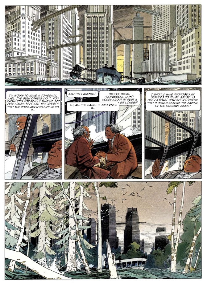
44. François Schuiten - Belgian
 | ||
| Schuiten's principle strength lies in his interiors and spectacular, vast exteriors. Best known for his 10-volume Obscure Cities, each album consisting (usually) of stories. In this unusual, somewhat experimental series he indulges in drawing precise, wonderful buildings. Faces he doesn't do that well though. Merely standard level, though that also depends on the album. This ambitious illustrator likes to try out different styles. Most albums are at least somewhat different from the others; there is never exact repetition from album to album, which is a two-edged sword, of course. On the one hand, if a reader finds that he prefers one kind of presentation the most, then naturally he'd perhaps wish for Schuiten to stick with it, not change it. On the other hand, there is variation instead of repetition. Not just the drawings, but the types of colour combinations hence moods vary too, and some Obscure Cities albums are even done in b&w, for whatever reason(s). In The Shadow of a Man red seems to dominate whereas the Samaris album (shown above) is mostly dominated by a light blueish hue. (I haven't read it, but visually it appeals to me the most.) In Road to Armilia he even included a story that utilizes a corny presentation that's pretty much exactly like the kind of picture-text shtick found in children's books. Not exactly a comic, that one - though the rest of that album can still be considered a comic-book. Aside from the title story, that is, which is designed and presented in a very unusual way: nearly all of the pages are splashes, and every other page is just textual. It is said that this is his weakest Cities album. I can certainly understand why readers would be averse to the kiddie method, not to mention the text-only approach which is pretty much a no-no in comics.
|
43. Juan Giménez - Argentinian
 |
| It took me until very recently to finally get round to reading the Metabarons
series, part of the famed and infamous Jodoverse, and it's purely
because I wasn't fully convinced that Gimenez was the right choice.
However, once you start reading a Gimenez comic you get used to its
flaws, but more importantly you get to admire his strengths. His main flaw is the way he draws faces, just not my cup of tea. He does them wonderfully for album covers, i.e. he was certainly capable of doing them properly. But it's just that panel-to-panel he puts little effort into them, comparatively speaking. Nevertheless, he does convey emotions very well, which must have been partially why Jodorowsky picked him in the first place. Jodorowsky's Metabarons are all loony fanatics, never shy to show extreme emotion (usually hate and anger), which is pretty much how Gimenez depicts them, to the power of ten. Jodorowsky is just generally over-the-top in his approach to story-telling, so Juan's style suited this kind of characterization very well. What Juan did best are spaceships, monsters, the weaponry, the scenery - all painted properly and meticulously as opposed to being CGI-coloured like LEGO toys. There is no doubt that had his comics been CGI-ed, he would never have made it on this list, nor would have I likely read any of them. They would have looked awful, as indeed there isn't one great illustrator whose drawing can't be ruined by computers pissing all over the artist's canvas. As a result, there are many awesome splash pages in the 8-episode Metabarons series. |
 |
| The Metabarons is an absolutely riveting read, very highly
recommended. There are nitwits out there that can't handle Jodorowsky's
insane genius and his flights of fancy, and such baboons will usually
blather about how disappointed they were with the Metabarons (or just
about anything else from the Jodoverse), but pay no heed: these are
cretins who read Marvel and western comics only. Pearls before swine... The Metabarons is the best serial in the Jodoverse that I've read so far, even better than Incal and Technopopes, serials that are great fun in their own right. It is sci-fi played to the hilt, sci-fi exactly as it needs to be: there's elements of fairy-tales, space opera, there are bizarre worlds, fun creatures, imaginative landscapes, playing around with laws of physics, there's also philosophy, adventurous toying with cosmological concepts, high drama, tragedy and comedy, many plot-twists, plenty of action, and none of the 8 albums (around 550 pages) ever get boring even briefly. You'd have to be a retard not to appreciate it, the sheer scope of it. So no, it's not recommended to marvelistas and mangatards, just the intelligent comic-book fans. |
 |
| Shown here is an impressive splash page from The Fourth Force, an earlier work which is said to be weak story-wise - but only by clueless people. I've read all four episodes and it's a very entertaining series. Because of the somewhat convoluted and "messy" story-telling approach, TFF may confuse the easily bewildered (or the lazy), but if you're an intelligent reader and a fan of sci-fi, then this is definitely something to check out. TFF was written by Gimenez himself, and he shows a good knack for writing. |
42. Al Jaffee - American/Jewish
 |
| What makes Al unique are several things: 1) his ability to make people look more ridiculous than any other cartoonist could do, 2) his on-target sense of humour, and 3) original ideas. He is one of those rare cartoonists whose material is occasionally laugh-out-loud funny, not merely amusing or cute. |
 |
| The only thing that annoyed me was that he was a bit of a left-winger. (A New York Jew, so it's hardly unusual.) Fortunately, Mad Magazine wasn't just a political publication, or at least not extremely, and at least not as one-sided as for example the shitty, unfunny SNL which is basically just another platform for liberal propaganda, so I didn't have to deal with his preachy nonsense too often. |
 |
| Al often draws himself, but not just in the role of a smart-alecy asshole, as shown here. He often draws himself as a grinning idiot, too. (You'll find him on the first page I provided, in the subway.) Snappy Answers to Stupid Questions is probably his most popular series. He is 98 years old, and worked for Mad Magazine for a record 64 years. That's a LOT of anti-Republican propaganda! |
41. Corrado Roi - Italian
 |
| Along with Stano, the most popular Dylan Dog illustrator is Roi, and there are good reasons for it. (Other worthy mentions are Siniscalchi, Cossu, Mari, Dall'Agnoll and Nizzoli. The ones to avoid: Saudelli, Freghieri, Grassani, Montanari, and Bigliardi). Roi is my personal favourite from that entire bunch, as he is for most fans, even better than Stano. I guess I am a sucker for excessive shading. Roi's dark, shade-heavy, stylish drawings are reminiscent of Dino Battaglia and Alberto Breccia, and as such this style suits these horror stories better than all the other Dylan illustrators, of which there are at least 20-30. Ugolino Cossu, for example, is a very good illustrator but his style is too elegant and "cheerful" for a horror setting. The less said about Dylan's bad illustrators, the better... I suggested earlier that Dylan is by far the best Bonelli character/hero. Not quite true. There is another good one, Martyn Mystere. Just thought I'd mention him. Martyn is a similar series to Dylan except much more talky, far more exposition i.e. more "historic" (read: pseudo-historic in the Ancient Aliens vein), a little less supernatural, more sci-fi, less horror. |
 |
| Very recently Roi really went all-out and illustrated perhaps his best work so far. UT (shown here) is a post-apocalyptic sci-fi serial consisting of 6 100-page episodes. Unfortunately - and very stupidly - it's been released in a small Bonelli format. No idea why, because this level deserves a full A4 treatment. I haven't read UT yet: fans are quite divided over the story, but apparently it was clumsily handled by the overrated Dylan mainstay Paola Barbato (who often tries to be too clever for her own good). Another recent album is Apocalypse, a 90-page interpretation of the texts from the New Testament. It is richly illustrated, pretty much in the exact same style as UT, but the story is somewhat disjointed and verges on silly at times. It's mostly boring and confusing i.e. nonsensical. |
40. Alex Raymond - American
 |
| Those old Flash Gordon
episodes are indeed horribly childish, silly and repetitious. In fact, let's not
beat around the bush: they are practically retarded. The
characterization, the dialog, the plot - it's all Edwoodesque in
essence. Every adventure is structured around a simplistic formula: Flash finds himself in an alien civilization, Flash is captured (and/or befriends these people then helps them beat monsters and/or an unfriendly civilization close-by), and Flash is the target of love-interest from some alien chick - which makes not only Dale jealous but also some beta cuck alien what hates Flash and plots to murder him. There is always a traitor. This shtick happens over and over, with only slight variations. Reading Raymond's FG is like Bill Murray going through Groundhog's Day. Especially the various imprisonments; Flash and company get captured at least 100 times in the course of Raymond's series (and presumably after it too). If Flash isn't fighting a monster or a jealous humanoid then he is probably getting captured - or plotting escape. But the worst plot-device by far is having Emperor Ming involved in the plot. After about 50 Flash vs Ming rounds of fight/capture/escape repetitive loops, Ming becomes the most boring and predictable villain in the history of cheesy sci-fi. Why Raymond couldn't expand Flash's world to a few more major villains, I have no clue. Hilariously enough, what saved the series from a total Ming monopoly (Mingopoly) was Pearl Harbour. After America entered WW2, Raymond quickly wrapped up the Ming saga so he could send Flash to Earth to fight some Nazi-like enemy. Flash unintentionally comes off as a gullible overly principled buffoon on several occasions, when he for example spares the life of a crook - which usually results in the deaths of many innocent people. It's laughable how many thousands of humanoids lose their lives as a result of Flash's absurd idealism. Raymond takes this idiotic shtick so far that at one point Flash actually makes peace with a guy who had betrayed him - then gets betrayed AGAIN by the same person. The stories are really dumb. However, und das ist ein big HOWEVER, the illustrations are great, and they only get better and better. At the latest halfway through the series (the 6-album volume of Raymond's Flash) the drawing markedly improves, becoming more precise and stylish, and the panels are much larger than at the outset when everything is rather tiny. Anyone who considers this kind of "old-school" drawing style to be "outdated" - while actually preferring the modern Marvel/DC comics - is a complete and utter dolt. Was that diplomatic enough? Great art is never outdated. Brains stop working, quality art never does. Raymond also did Jungle Jim, and started the very popular detective series Rip Kirby. Guess what? No Emperor Ming in either of those, which is slightly surprising but very welcome for sure. |
39. William Vance - Belgian
 |
| One of the most successful illustrators from the Franco-Belgian school is undoubtedly Vance. While he is most famous (in Europe, of course, not the States) for Bruno Brazil, XIII and Bob Morane, personally I consider the historical Bruce J Hawker (shown here) his best series. It consists of 7 episodes, spectacularly coloured by his wife. Some people disparagingly say he did that serial "just as an excuse to draw old ships", which if true is fine by me, because I bought those albums pretty much for the same reasons: brilliantly drawn ships and the ocean scenery. What's wrong with wanting to draw old ships? Certainly beats drawing masked clowns jumping around in tights. Besides, the stories are fairly solid. |
 |
| Another historical series is Ramiro (shown here). Vance's style is elegant and disciplined, showing particular strength in the depiction of scenery, vehicles and edifices. His depiction of people is also classy and precise, but he has limited ability to convey much emotion. His characters are more on the robotic side, though not extremely so and not always. Furthermore, the main hero in all of his serials look basically the same. He is after all a mainstream cartoonist. (Relatively speaking, of course. To the average American marvelista his style might even be construed as avant-garde.) However, this style can please both fans of the commercial and the more "arty". He hits a good balance that way. |
38. Simon Bisley - British
32. Hermann Huppen - Belgian
31. Mort Drucker - American/Jewish

30. José Ortiz - Spanish
21. Julio Ribera - Spanish
15. Floyd Gottfredson - American
14. Robert Crumb - American
4. Enes Bilalović aka Enki Bilal - Serbian/Czech/French
3. Richard Corben - American
 |
| It is stated that his influences include Frank Frazetta and Richard Corben. Nobody could argue with that. Along with Storm, Mercenary, Kastaka and a few others, Bisley's Slaine is one of those very rare comics that essentially consist of paintings, rather than the standard panels that are drawn, inked and then coloured in a simpler, traditional (and lazier) way. The drawings themselves are quite good but it's the exceptional use of colour that makes Bisley a standout. You won't a find a more colours-crazy comic than Slaine. Only some of Corben's early stuff comes close to displaying such a vast array of colours and colour combinations. And if I mention the word "colour" again, I'll let Slaine chop my head off... He did some heavy metal album covers too, mainly for Danzig with whom he also collaborated on Danzig's comics. |
 |
| Story-wise Slaine is basically a thinly-veiled feminist spin on Conan, as strange and stupid as that may sound considering that Slaine is basically a very obvious rehash of the famous - and politically-incorrect - barbarian. The writer Mills, basically just another virtue-signaling brainwashed Establishment sycophant, based this fantasy world on the highly controversial theories of archaeologist Marija Gimbutas concerning the matriarchal origins of Celtic history. Maria was a loony feminist charlatan who misused discoveries to build non-provable, biased, agenda-based theories which the pigeon-brained Mills deemed essential to use in this story of butchery and extreme violence. But, as all left-wing buffoons, Mills clumsily achieves almost the opposite effect by turning the story's goddess into a vicious, deceptive, life-loathing, treacherous monster. Mills's plea for a matriarchal world is at once laughable, contradictory, non-historical, silly and asinine. Unlike Conan's world, which is grounded in easy-to-appreciate, feet-on-the-ground, common-sense morality, Mills's fantasy world is nihilistic, cynical, masochistic, and full of absurd contradictions. To reflect Irish (and Scottish) mentality itself? Either way, it is for this reason that the reader cannot root for Slain with the kind of pure, fun relish that one does for Conan. Fortunately, Beasley's great talent saves the comic from doom. Mills's characters are interesting, but his ideology and his logic are deeply flawed. His fanatical belief that this story needed to include such idiotic PC philosophy was a great error. It didn't. Stupidity is never essential. |
37. François Boucq - French
 |
| One of his best works is the 5-part Moonface series (shown above), scripted by the controversial loon Jodorowsky. An entertaining dystopian romp, mixed with humour and typical Jodo-nonsense. Another series he did with Jodorowsky is the 9-album Bouncer, a violent western. The series is mostly apolitical, but it does have some unnecessary Confederation-based horseshit and boring lectures about racism, not to mention some astoundingly idiotic writing firmly reliant on wild coincidences and absurd behaviour. (If I hear yet another anti-racism message/lecture I am liable to become a racist simply out of spite! I am tired of hypocritical virtue-signalers and their idiotic subservience to the current political climate. This kind of political/cultural sycophancy is absolutely no different to the kind of obsequious mindless racist hysteria that reigned among the German masses during Hitler's rule. Anti-racist hysteria is not an iota better than pro-racist hysteria. Hysteria is hysteria, and fanaticism is fanaticism, regardless of the ideology behind it, and such dumb behavior never brings anything good.) And yet, if you are familiar with Jodorowsky's background you shouldn't be too surprised by this. |
36. Sergio Aragonés - Spanish/American
 |
| Unlike some other spoof cartoonists, especially the modern ones, Sergio isn't a bitter self-loathing cynic (i.e. some faux nihilist poseur); he is down-to-Earth, and totally unpretentious. His observations about humans are cheerful rather than nasty. (I.e. he is a much better person than I am.) He often casts himself in his comics: photo above. And he clearly enjoys accentuating his "spanishness". Being Spanish-born allows him to get away with playing around with Latino cliches and stereotypes, similarly to the way only Jews can make snide comments about Jews without being crucified in the media. Or the way blacks can say the word n... nagger. (South Park.) His drawing style is relatively simple, but fluid, original and instantly recognizable. He got somewhat more sloppy later on, but not in a big way. The comics definitely look a lot better in colour, despite the fact that a lot of his work was published in b&w. |
 |
| It's obvious that Mad Magazine snatched up the best American illustrators, and left the crap ones to Marvel & Co. By "crap" I mean the average ones. They are merely crap by this list's standards, although there are also some truly crap superhero cartoonists. Some of them are even "legendary". Won't mention any names Gil Kane. Speaking of which, although his Mad stuff is undeniably fun, some of his best and funniest work consists of his spoofs of Marvel/DC characters. Sergio Aragones Massacres Marvel (shown above) and Sergio Aragones Destroys DC are very funny/clever spoofs. Not that parodying superhero clowns is especially challenging! Of course, his most well-known series is the long-running Groo, a kind of Conanesque spoof. It is fairly entertaining. |
 |
| Aragones is well-known for his ability to draw with lightning speed, something that has been said of Moebius as well. Except that Sergio never did any shit drawings... |
35. Hal Foster - Canadian
 |
| The skill-set that Foster displayed in his marathon series Prince Valiant is obvious and indisputable. Very elegant, precise, above all disciplined, masterful - and highly consistent: not just from panel to panel, from year to year but even from decade to decade. Most illustrators of reality-based drawings get sloppy over the years and their work gradually deteriorates, sometimes drastically. Not Foster: the man was a robot. Some people prefer PV in b&w which is a bit mystifying. B&W looks good, but come on... The decision not to utilize balloons - in favour of classic narration - is something I can understand, but don't support. I understand that balloons annoy many illustrators because they "ruin" their nicely-drawn panels, but one of the charms of comics are precisely these balloons - whether round or square-shaped. Prince Valiant appears kind of detached as a result. That awful hair-cut was a key reason why I'd stayed away from this series - at least until recently. The decision to give Valiant such a pathetic, girly look was a baffling mistake. Or do you know of any PV reader who likes the series because of his shitty hair-cut? I don't. I finally got round to reading it, from the beginning. During the first 5 volumes the stories are fairly fast-moving and abundant, with plenty of action: that's until around 1947. After that, Valiant marries, starts having babies, which is when the factor of excessive cheese is introduced; the romantic bullshit slows down the stories considerably, and the soppy crap becomes very tiresome, quickly. The series becomes too "cute", devolves drastically. The humour becomes very old-fashioned too i.e. sweetoshittic. The character of his wife is supposed to be bubbly or whatever, like female characters from dumb old b&w Hollywood comedies, but I find her irritating. I don't know whether things improve in this regard, since I'm stuck at 1949 at the moment, so I don't know. (Foster worked on it until the 70s.) I'm not too motivated to continue with the series any time soon. Things can get pretty stupid, too. In the war against the Picts (volume 1949-50), Valiant's annoying wife saves the day by feeding the enemy. You read that right. Then she saves her wounded hubby by using an on-the-spot blood transfusion. Fookin' hell, I can understand a certain measure of naivety and silliness in a Disney-like series but this is way too dumb. Even if I were a 5 year-old I'd feel insulted. I don't mind wild historical inaccuracies in terms of kings, wars and locations, but when it comes to basic logic things need to have at least a semblance of realism. Foster must have considered his readership retarded. (And doubtlessly some of it is.) Before starting the prince with the bloody silly hair-cut, he did Tarzan. |
 |
| Foster is one of only two cartoonists on this list born in the 19th century, and is the 2nd oldest. His influence is enormous. He is the only Canadian on this list, and the northern-most illustrator. The majority of top comic-book illustrators are from warmer regions, very few from colder climates (Britain being the notable exception). I wonder why... No, I am not being sarcastic; I really have no clue why this is. Or why northern European countries are superior to southern ones in metal. Women illustrators: Or why this list is made up 100% of male illustrators... Perhaps women just aren't as creative and as gifted in the arts: in music, men pretty much dominate, as well, at least in terms of the song-writing quality. In cinema, great female directors are very rare, and I very much doubt that "discrimination" has much to do with it. Discrimination is the all-purpose excuse/explanation/rationalization/scapegoat/drivel that left-wing knuckleheads use for nearly everything, because they have one-track minds that struggle with complex concepts, plus they can't deal with the truth. When you're stupid and you hate truth, the path to the Dark Side of political-correctness is almost unavoidable. This disbalance isn't nearly as large as in comics though where it's a totally one-sided sweep: I have yet to find a high-quality female illustrator. There are several that are solid, but unexceptional. Quite literally I don't even have a female candidate for this list, not even if I were to expand the list to 150 cartoonists. I'd very gladly include one, but I'm not in the business of Affirmative Action, as some dupes, dopes and sycophants are. Admittedly, girls read comics far less than boys hence adult females are far less likely to turn to that profession. (Trying to be a little politically correct here, but somehow I'm not good at it.) |
34. José Luis Salinas - Argentinian
 |
| If Salinas had been as consistently impressive as shown above, I'd have ranked him in the top 50, easily. However, for whatever reasons he didn't have great consistency. One of his strengths was close-ups of characters, but occasional panels seem rushed. Cisco Kid, shown above, is what he is famous for. A long-running western series, beginning in the early 50s, with rather primitive, dumb scripts written by a talent-free hack called Rod Reid. But hey: it's a western after all! Simple characterization, predictable/lame stories and sometimes outright idiotic plot-twists. (I am basing this on the first 5 episodes, which is all I managed to get so far.) Still, some of the stories are better than others: not all of them are full-on trashy, some are merely semi-trashy. It is downright scandalous what certain publishers used to do with this serial, in the 70s and 80s when it was being featured in various magazines. They used to not only cut up panels, re-arranging them to fit the format of their magazines, but they actually deleted/omitted certain panels - and even messed with the original panels by "correcting" them: adding things, or deleting certain sections! That's what you get when Commies assault a comic book... This was done with several other b&w serials too. |
33. Takehiko Inoue 井上 雄彦 - Japanese
 |
| Another Japanese illustrator, but this one wouldn't have been included either were he yet another conveyor-belt manga-mercenary robot raking in large amounts of Yen in exchange for drawing people like cretins. Inoue has such an obviously elegant - and very importantly a measured - style that even the biggest manga haters have to admit that he doesn't have very much to do with the traditional mangatarded comic-book and is rightfully included on the list. That's right, they are comic-books: mangas are simply comics from Japan, they are not some weird off-shoot of comics that deserve different definitions and special treatment. But I discuss this later again... |
 | ||
| I've read 3 Viz Media volumes of Vagabond so far, and judging from these 9 first tankobons, this is one of those must-have serials. Highly recommended. The samurai concept and the intelligent/tense script are a refreshing change, both from the usual cowboys'n'Injuns and crime action bullshit, and there is far more depth to the characters than in your typical action comic.. There seems to be little or no cheesy moralizing and no disgusting PC agenda whatsoever - as is the case with practically every Western comic published in the last 2-3 decades, which is largely why I avoid anything written in the last 10-15 years. (The other reasons being drastically falling artistic standards, and horrendous computer colouring.) Inoue is Japanese so by default he is far less receptive to all of that moronic, hateful, left-wing propaganda drivel, or at least isn't interested in polluting his work with it. (Which is why I consider mangas the only future of comics, shit as the vast majority of them may be.) Besides, this is about the age of the Samurai, hence there is no room, rhyme nor reason to include the obligatory PC horseshit, or at least I hope so. (There are altogether 12 large 630-page volumes so I have a lot to read before having a far more informed opinion.) I hope to add more detail later, as I get to read more from the best manga illustrator. Vagabond is the 24th biggest-selling manga of all time, which is quite surprising considering how the masses prefer garbage manga over the good stuff. Inoue's previous manga series, about basketball, sold even more; it is in the top 10.
|

 |
| Along with Vance, Hermann is arguably the most successful Flemish Belgian illustrator. When one talks about the "Franco-Belgian school" (and one often does because it was so influential - before turning crap) what it might appear to mean is only French-speaking artists. But that isn't true, because there are several key Flemish cartoonists as well. I used to not read that much Hermann, because back when he was at the top of his game he used to do way too many westerns and generic adventure comics. Now that his scripts are written by his son they are not worth bothering, and his drawing and colour have anyway deteriorated. I found the early episodes of Jeremiah mostly dull, I could barely finish one album! Only recently have I managed to complete 3-4 episodes. They range from boring to average - but that's the early Jeremiah episodes (1-6) which are considered by some very confused readers to be much at least as good as the rest (7-37). Nevertheless, recently I read episodes 10-21 and they are all quite good; far less westerny, more original, never boring. From episode 19 onward the illustration quality drops markedly. However, the colouring improves drastically from the same episode: watercolours(?), from the looks of it - a very rarely used method, unfortunately. This means that the overall quality remains the same - at least until episode 30, roughly. The quality probably drops after that. Jeremiah is a post-apocalyptic serial, which is theoretically a bullet-proof genre in the comic world, and yet it's - initially at least - conceived and presented in such a dull and mundane way in the early episodes that it comes off as some shitty little neo-western. When I was a kid I didn't realize or even suspect it was set in a post-nuclear era, because it's presented in such a drab, conventional way! I had no clue these characters had survived nuclear war: they looked like regular horses'n'beans desert-rat assholes i.e. cowboys. Whether one likes his serials or not, Huppen's brilliance is obvious. Jeremiah is his most famous serial, quite popular, although his medieval series is almost as well-known. Hermann has also done a bunch of one-offs, including a Dracula story. But be warned. Hermann's comics got worse in recent years, due to weaker drawing, weaker colouring and weaker scripts. Focus on the 80s and the 90s, and you can't miss. |
 |
| Another warning: Hermann's damn stupid faces. The one thing about his style I very much dislike is how he drew/draws people, especially women. Seriously, the men look like mongoloids, and the women look like men in drag. Little children can draw better faces than this! Someone hilariously referred to his characters as "hobbits". Thereabouts. One eventually gets used to these "Hobbit faces" though: they are not a hindrance to enjoying the albums. One can even argue that this adds an element of originality to his work, though this would be a matter of opinion. The people/scenery discrepancy - a common affliction even among greats: A large number of illustrators can do scenery fairly well, or brilliantly - as is the case with Huppen. But what really separates the men from the boys - in a sense - is the ability to draw people's faces in a stylish or interesting manner and to successfully convey all relevant emotions through them. In this Hermann is a failure. In fact, most illustrators competent in portraying scenery/backgrounds fail in this regard; very often there is a big gulf in those two areas. Kind of like a great tennis player who can't volley very well, except that volleys aren't as important in (modern) tennis as faces are in comics. A common occurrence for me is to open a comic from an illustrator I'm not familiar with only to find out that he does scenery well - or even superbly - but disappoints with faces and emotions. (Admittedly, the reverse also exists: cartoonists who do faces/emotions well but can't handle backgrounds, or aren't inclined to spend much effort on them. Though that's more rare, possibly because faces depend on small nuances, backgrounds don't.) Then there is also the category of cartoonists that are capable of drawing emotional characters but who do it in an aesthetically ugly way. Some of them draw people with too much of a grotesque element, or in a way that is simply unappealing to most normal humans. Hermann excelling in backdrops on the one hand and being miserable in faces/emotions on the other is possibly the biggest example of such a "quality gulf" on this entire list. I mean, just look at these "women"! Would you rather watch these unintentional abstract-art caricatures of female humans, or would you rather watch beautiful women drawn by the likes of Romero and Fernandez? All of the examples shown here have zero femininity; they might as well be drawings of men. Or trannies. If you like trannies you will probably disagree. What a joke. It's as if Huppen were some sort of autistic semi-genius who specializes in the most complex backgrounds - yet struggles greatly at achieving even rudimentary levels when it comes to people. There are many average/mediocre cartoonists who do far better faces than Hermann. If his artistic "people skills" were (significantly) better he'd be much higher up on this list. |
 |
| And yet, he drew faces much better in his Bernard Prince series, which he mostly did in the early years of his career, 14 albums altogether, starting in 1966. This opens the possibility that he intentionally started drawing people like freaks for Jeremiah, which started a decade later in 1977. If true, this would make even less sense than incompetence. Still, it's not as though his Bernard Prince characters were illustrated significantly better; the range of their emotions is still rather limited, and the faces themselves are average at best. (Women look much better than in Jeremiah, but they're hardly beauties.) Bernard Prince's main (and perhaps only) strength is its top-notch scenery - especially when coloured well, which is not necessarily the case with the page shown above. (What's up with the blue faces?!) The stories themselves are standard adventure fare; quite unoriginal, predictable and old-fashioned in structure. I'd recommend BP only to fans of generic action comics. |
 |
| Blood and excessive violence, every boy's dream. This is really what Hermann deserves most of the respect for. A page from his best series, Towers of Bois-Maury, a popular long-running series set in medieval times. I haven't completed the whole thing yet, but what I did read so far (episodes 1-9) is impressive. The scripts are tight and original and the stories fun despite the heavy themes - or precisely because of them. This ain't no Prince Valiant, that's for sure, i.e. not another Disney version of the Middle Ages; Hermann went for a gloomy, realistic, savage depiction of that era, a decision which I completely support. Towers has a reputation for being too talky and depressing, but whoever claims that is probably too far gone in their marveltardation to appreciate anything halfway good. The illustrations and colours are excellent - roughly on the level of Jeremiah 12-15. There are 16 albums in this series, but only the first 10 are considered the "real deal", the rest being done later as a sort of prequel or whatever and with much weaker drawing (though with partially improved colouring, at least in the early episodes of the prequels). |
 |
| He did movie spoofs for Mad Magazine for decades, from the 60s onwards. His drawings started getting "thinner" i.e. weaker i.e. lazier i.e. less detailed after the 80s so I gradually lost interest. The quality of the gags very much depended on the movie being spoofed and on the writer, but generally speaking they were a lot of fun. |
30. José Ortiz - Spanish
 |
| Jose's most famous serial is Hombre, shown here. A sort of post-apocalyptic anti-hero. Jose utilizes a detailed, rich, loose style, which nevertheless lends itself to colour and b&w equally. The 550-page series consists of 10-page episodes to the most part. The first half was done in b&w, the second half in colour. That b/w half is better illustrated, and is allegedly less heavy theme-wise though I'm not sure I agree with that assessment. Both halves are a great read. |
 |
| Not all of his stuff is suited for colour though. Some of his short (and fairly unusual) horror stories for Creepy are ideally suited only for b&w. They tend to be (even) more detailed than Hombre, even denser hence utterly unsuitable for colour. (Gotta re-iterate at this point that while I enjoy both, when given a choice between colour and b&w I'll nearly always choose colour. Unlike all those pro-Marxist cuck edgelords.) Ortiz's style is somewhat reminiscent of Breccia, Roi, and other "shade masters" and mood-meisters. Perhaps there is no better way to convey a dark atmosphere than by drenching the panels with excessive shading. This, of course, requires discipline, talent, and time. But the results can be mesmerizing. Obviously, not all shade masters are mood meisters, but all mood meisters are shade masters. Comprende? |
29. Giorgio Cavazzano - Italian
27. Paolo Eleuteri Serpieri - Italian
25. Enrique Romero - Spanish
24. Arturo Pérez del Castillo - Chilean
23. Jim Holdaway - British
22. Francisco Solano López - Argentinian
 |
| Italy's
Disney illustrators are numerous and most are very good (and usually much better
than their American counterparts), such as Mazzarello and Freccero. Also notable are Fecchi, Soldati, Mottura, Mastantuono, Vian, Pastroviccio, Gotardo, Perina, Gervasio, Intini, De Vita, Casty, Mazzon, and De Lorenzi (honorable
mentions), but none are quite as good as Cavazzano. Aside from Donald Duck, Mickey Mouse and Uncle Scrooge, he did various other serials such as the unknown one shown here and Captain Rogers. |
 |
| Italian obsession with westerns: It's very unfortunate that many great and good illustrators - especially Italians - wasted their talents on dumb-ass westerns, and just because the reading public tends to be on the primitive side. (Sort of the way moronic Hollywood caters to morons by making moronic movies, especially in recent years.) Obviously, I am not referring to Cavazzano's gag comics, I mean all those boring stereotypical gun-wielding western comic-book heroes, of which there are way too many to list them all. Well, might as well mention Tex Viller while I'm at it... Both Captain Rogers (shown here) and the previous one are western-based comics, which is typical of Italians. Nearly all of their (commercial) comics are set in the States, and a bulk of those specifically in the Wild West. After all, they created the "spaghetti western", so why wonder... And yet... Why? I have a theory. (I always have theories.) Italians are generally somewhat childlike, they'd probably be the first to admit this, so maybe that's why they are so enamored with cowboys'n'Injuns, a genre not particularly known for its originality or intellectual content. Unlike me. I am also childish, yet very bored with westerns. |
28. Marcel Uderzo & Albert Uderzo - Italian/French
 |
| Believe it or not, Albert (shown here getting his ass kicked) is yet another Commie f**k. Why does the cosmos give such great talent to such assholes? There is left-wing propaganda in Asterix's more recent episodes. Yes, Al, like so many virtue-signalers in the increasingly preachy comic-book world, liked to inject his post-Goscinny episodes with subliminal left-wing propaganda BS, which ties in so neatly with the fact that he was known as a total asshole in private life. You shouldn't be at all surprised, considering that nowadays almost every aspect of popular culture is drenched with Cultural Marxism. In every form of media it is near-impossible to evade leftist political indoctrination, certainly this is true for western countries. 20 years ago I would never have thought I'd say this but... F**k the West and the Marxist cock it's riding on. To illustrate just what an asshole he was, consider the fact that his brother Marcel inked a large number of Asterix episodes, yet never got any credit for it, nor was paid royalties for his work. Absolutely amazing. It is a miracle that the brothers fell out as late as they did, and not earlier, for example already in the 70s. I've been a fan of Asterix since I was a kid, yet only now, many decades later, did I find out about this guy. In fact, most fans of the series have no clue about his existence. It's as though Albert had kept him as his secret slave for so many years, letting him do the brunt of the work while hogging all the credit and fame for himself. Marcel drew the last page in the Belgians episode entirely by himself (a Breugel parody/tribute), yet he got zero credit for that too. He also did the colour for many of the earlier episodes. So am I surprised that Albert is a hypocritical left-winger? Of course not. It's just like a Commie to love money this much, to place it over family. After all, don't communists always place the Party over the family unit? The Party stands for money and power, so it all makes perfect sense. Just as it makes perfect sense for narcissistic egotists to use left-wing ideology as a sort of cover, just as a serial-killer might be the head of a humanitarian organization. A recent study showed that internet virtue-signaling was very commonly practiced by sociopaths. and narcissistic people. |
 |
| Everyone knows Asterix, so there's no point in going into lengthy commentary. Suffice it to say that the drawing noticably improved over the years, a common trait in the French-Belgian school when it comes to caricature comics. Compare the 1st episode with the 10th and then compare the 10th with the 25th. The fluidity of the lines increases to the point where Uderzo became good enough to make it on this fine, prestigious list. I am sure he'd feel honoured... the Commie bastard... I ask again: why does nature give artistic gifts so often to shitbags? Because nature is run by Satan? Because talent and/or success corrupts people? Because most people are assholes anyway? Because sucking up to the left-wing Establishment brings more profit? (The irony is staggering... sucking up to the Left - in order to get richer. Far more common than many realize.) What should you read? Uderzo illustrated the first 33 episodes, and that is basically the cut-off line. However, I've read all episodes until and including no 30, so I can't vouch for the last three he did; they may be weak(er). In fact, they very likely are. Goscinny wrote the first 24 albums. Uderzo took over from no 25 onward, and his writing was pretty good so I recommend the Uderzo-scripted episodes as well. Goscinny was the better writer, hence the best-scripted episodes are his: Asterix the Gaul, Asterix and the Goths, Asterix the Gladiator, Asterix the Legionary, Asterix and the Great Crossing. But essentially you can't miss with any of the first 30 episodes. Everything after no 33 is Asterix in name only; ignore these newer episodes. They were/are created by a completely different team of people, and they are inundated with Cultural Marxism, from what I've heard. There is actually even allegedly a "girl-power" episode with an anti-war message! If this is true (and I lean toward believing that it is) then soon we can expect episodes such as Asterix Helps his Syrian Friends Reach France, Asterix Turns to Islam, Asterix Helps Organize A Gay Pride March, Asterix Gives the Magic Potion To Antifa So They Can Bust More Heads, Asterix & Greta Turdberg Stop Climate Change, and Asterix Kills Trump By Sending Him To A Gulag. You think I'm exaggerating? Well, many years ago I had predicted that the James Bond producers would eventually hire a black woman to play 007, and that is actually happening, so do not - ever - underestimate the insanity of the Orwellian Far Left. Modern French comics are anyway mostly about political indoctrination, they are awash with leftist propaganda hence have very little to do with what the original purpose of comics once was i.e. to entertain, to be fun. Like most avenues of "entertainment" these days, comics have become just another means to brainwash the masses with excessive preachiness, especially impressionable clueless young people. |
 |
| Some people are unaware of Uderzo's other work. Oumpah-Pah, a cheerful series about an American Indian set during French colonial rule, is as charming and at least as well-drawn as Asterix's early episodes. (In fact, for some reason the drawing in early Asterix appears weaker.) There are only five episodes though, all from the late 50s/early 60s. |
 |
| Also notable is the slick Adventures of Tanguy & Laverdure, a popular and long-standing series about French airforce pilots which had its by far best drawing during episodes 1-7 while Uderzo was working on it, during the 60s. Uderzo's depictions of aircraft, people and scenery is excellent. However, the writing is well behind the illustrations. In fact, it is garbage, possibly the worst and dumbest comic series I've ever read. I've so far read three episodes (4 to 6), and they all rapidly descend into absolute idiocy. Much is made of the alleged realistic portrayal of the French Air Force, but if this were true i.e. if these episodes are anything to go by I'd have to conclude that French pilots and their bosses are complete idiots, too stupid to anticipate sabotage even when all signs point toward it, and when they do suspect there might be sabotage (and there always is) they act like gullible cretins. Hence why the bad guys constantly refer to the French as "imbeciles" and "cretins", which is the same conclusion the reader must reach. Yes, nearly all of the episodes, not just the three I've read, have almost the same copy-paste plots which involve numerous saboteurs and sabotages of French aircraft involving spies and criminals, a plot-device that becomes instantly tiresome, as all repetitive over-used plot-devices do. In fact, the entire series should have been called "Sabotage", because that is the only shtick that Charlier could come up with. The great thing about Asterix, for example, is that most episodes are fairly different hence readers can't easily predict what happens next, unlike in "Sabotage" where the reader gets quickly bored with an overused formula. But that's because Goscinny is superior to Charlier in every way; Goscinny is Kubrick next to Charlier who is like Verhoeven, De Palma or even JJ Abrams. The dialog is horrible too: most of it is either dull small-talk or involving completely unnecessary technical detail that makes these comics top-heavy on extremely wordy, boring balloons. The jokes are no better; they are essentially reduced to Laverdure falling over things i.e. typical awful banana-peel French humour. Charlier was a pilot, and perhaps a pilot he should have stayed, because his spy stories are pedestrian at best and his scripting utterly shit. He should have worked as a technical consultant for the serial, not as its writer. How and why this cretinous series managed to stay popular for decades, even after Uderzo was replaced by the vastly inferior Jije, is a mystery. |
27. Paolo Eleuteri Serpieri - Italian
 |
| I've only recently started reading his most popular series, Druuna,
an erotic sci-fi thingy. The
Sexweib shown above is naked or at least very scantily clad in (almost) every page of every album.
Obviously, that's only because her large ass and ample boobs are so extremely relevant to the stories themselves! Or would you actually accuse an Italian illustrator of using nudity as mere titillation?! Don't you know that nudity in art always serves artistic purposes only? Italians are serious people! Southern Europe & Boobs: Italian and Spanish illustrators are far more likely to show nude lady bits than any others. Is it a result of Catholic sexual repression, or are Southern European illustrators simply more shameless about being filthy old bastards? Especially Italians have produced a large chunk of erotic and even pornographic comics. From the great ones most notably Manara, Serpieri and Jacovitti, from the overrated shit illustrators I could mention Crepax who is considered a legend yet who couldn't draw a pretty (and symmetric) woman to save his life. Yes, hipsterism is the enemy of us all. |
 |
| Nevertheless, it'd be a mistake to dismiss Druuna as plot-free sexploitation trash. The first episode Morbus Gravis has very obvious parallels to Dark City and Matrix, movies that are complete rip-offs of already-existing sci-fi premises. (Most cinemaphiles are under the false impression that Matrix was thematically a ground-breaking movie. It is in fact almost entirely derivative.) But there's more; the 2nd episode Druuna reveals a further crucial similarity to Dark City; yet another example of Hollywood's penchant for theft and a lack of originality. (And yet, this movie is one of the few very good Hollywood sci-fi films.) Episodes 3 and 4, Creatura and Carnivora, rip off The Thing, Invasion of the Body Snatchers and Alien, and are hence somewhat less original. If there is any valid criticism of excessive sexploitation to be made, it would be episode 5, Mandragora, the weakest of the first five (shown above). It is almost entirely sex-orientated hence sub-par. This episode also introduces hardcore porn into the series, whereas the first 4 were softcore i.e. certain things were self-censored. Hardcore porn always drastically cheapens any piece of fiction, something Serpieri either doesn't give a shit about or isn't even aware of. Nevertheless, by episode 7 Serpieri reverted back to soft porn. |
 |
| Faced with criticism over Druuna's frequent rapes, Serpieri stated that the comic "challenges Judeo-Christian morals regarding sexuality". That's basically a cop-out, just a stereotypically lame scapegoat claim, because among "artistes" it is hip to lambast major religions (especially Christianity; in fact, nearly always just that religion). In truth, Serpieri is just a filthy old man exercising his right to be pervy. There is little to no doubt that he has rape fantasies, that he gets off on women getting sexually assaulted. Of course, there is nothing wrong with the depiction of rape in a comic as extreme as this one. After all, if you choose to read Druuna you basically have to know what you're getting. If you don't, it's not Serpieri's fault you're uninformed. Yes, there are sex-scenes and violent perversion, but the lazy claim that Druuna is just pornographic piffle featuring a voluptuous maiden rolling around naked is nonsense. The series does have a fairly trippy story, not just gratuitous sex and gore. It is sci-fi with elements of erotica, not the other way round. Though that depends on the album too. There are 9 episodes, illustrated over a period of over 30 years. (Shown above is episode 0, which has essentially nothing to do with the series. An album completely devoid of dialogue and narration.) Refreshingly enough, despite the vast time span, the quality of the drawing drops only slightly - which is not typical of realistic-style comics. Serpieri claims he based Druuna on the French actress Valerie Kaprisky. |
26. Carlos Puerta - Spanish
 |
| If you're a fan of "painted" comics (for lack of a better term) as I am, you can't do better than this. Every panel is painstakingly illustrated and coloured, which makes me wonder in awe how the hell Puerta managed to create so (relatively) many albums using such a time-consuming technique. So yes, I suppose we could call Puerta the "anti-Persepolis". Or the "anti-Maus". He is the ultimate craftsman, unlike someone like Spiegelman who is the ultimate con-artist. Or one of many. Shown above is a page from The Red Baron, one of several historical works by Puerta. It is a spectacularly illustrated 3-album story consisting of about 150 pages. Some people complain that the story is "thin", but while that may be somewhat true - there is certainly relatively little dialogue and many balloon-free panels - the story is nevertheless riddled with historical details (visually as well as content-wise) and is actually an interesting, intelligent psychological study of a psychopath - i.e. the albums aren't just an excuse to paint 19th-century edifices and early fighter planes. (Manfred von Richthofen was only used as an excuse to do this type of story in a historical context, i.e. this is not a proper biographical account - as is stated in the introduction. Only loosely based. The real Richthofen was not a psychopath at all, by most accounts.) |
 |
| From an adaptation of a Jules Verne, The Astrolabe of Urania. Typically, his albums look like a collection of postcards, and I mean that in the most complimentary way possible. What makes Puerta's work stand out from the work of other similar "painter" cartoonists is his ability to draw faces really well, and to convey both subtle and obvious emotions with precision. Most illustrators of this ilk aren't able to excel in this, which makes Puerta that much more unique as a cartoonist. Like many other illustrators, he sometimes uses celebs/actors to base his characters' physical appearance on. Hilariously enough, in order to portray von Richthofen's arch-rival - a degenerate privileged royal - he chose Benedict Cumberbatch, who is himself pretty much a nepotist i.e. an elitist with questionable genetics. I had to laugh out loud when I recognized his stupid face. Especially since his character was portrayed as a cowardly moron in an earlier episode when he was a youth. |
 |
| Benedict Cumberbitch. Who better to play an in-bred royal? |
 |
| Christian Bale was used in certain scenes as the Red Baron, perhaps as a nod to the overrated trash-pile called American Psycho. But as many other "painter" cartoonists Puerta tends to vary the faces of the main characters. In certain segments von Richtfhofen is more similar to Jude Law. |
 |
| One of the most popular European pulp comics: Axa is
basically PG13-rated trashploitation about a sexy bra-hating semi-nymphomaniac blonde who stumbles
and fumbles around in a post-apocalyptic dystopian world littered with
monsters and horny guys (some of which are mutants hence a little too
much even for a horny blonde). I.e. EVERY boy's/man's fantasy made
flesh, or at least made pencil and ink. It is pulp, true, but it's very stylish pulp. I read this as a kid so I just had to buy the entire series, which for me encapsulates the original 18 episodes drawn between 1978-1986, released fairly recently in three integral albums. Plus a colour album he did back in the late 80s (shown above). Romero did 4 additional episodes 30 years later, 2011 onwards. While those are formally part of the series, there seems to be some controversy over them. I have barely any interest in them because Romero's style had drastically devolved by that point. Especially the way he started drawing the titular character is disappointing. All episodes are in b&w except that one colour special. Axa looks awesome in colour, but Romero's shading and style are so thorough, clean and disciplined that b&w looks great too. Fun fact: Axa was created for and published by the idiotic British tabloid newspaper The Sun. |
 |
| Yeah, well, she is using the word "sword" literally here. She can't imagine a paradise without that other sword... The Dits is strong with this one. |
 |
| And here is one of Axa's several sword-providers. But lest you fall into the trap of underestimating Axa (physically, not intellectually), I assure you, she can fight. After all, she is a bit girl-power too, not just kittenish, ditsy and horny. One half girl-power, one half gets-carried-around-by-big-muscular-guy. Sometimes cliches can be so much fun. |
 |
| Axa is a fast-paced series, very traditional that way; as simplistic as early Flash Gordon, but much more fun and certainly more original than the hopelessly pacifist, boring laser-gun waver. There is action
at every turn, and whatever exposition there is often gets uttered by
the characters during the action scenes themselves, or briefly between
separate action sequences. An exception would be episode 3 which is more static. There are pretentious, chip-on-shoulder morons out there who describe Axa as a "trashy" comic, insinuating that they are "above" reading stuff they used to wank to when they were kids. What those insecure knuckleheads don't understand is that Axa is pure pulp fiction and pulp was never intended to be intellectual, part of its charm lying precisely in its naive and generic approach to characterization and story. Sort of the way we enjoy so-bad-they're-good 50s monster B-movies, the big difference being that their comic equivalents aren't actually bad, because such a corny approach to story-telling absolutely works in the comics medium - especially when the illustrations are this good. In fact, Romero's excellent and disciplined technique makes the inane dialogues and goofy plots more appealing - if that makes sense. Usually pulp is drawn by average or mediocre cartoonists. Besides, a lot of these overly critical eunuchs (who want us to believe they're above tits'n'ass nudity) read primarily Marvel's idiotic superhero comics. Now, that is what I call real trash. And real irony, that fans of trash should complain about trash, even when it's not there. The pot and the kettle... |
 |
| Romero also did Modesty Blaise after he took it over from Jim Holdaway. Romero wasn't as consistently good as he later was with Axa. His Modesty isn't nearly as attractive as Holdaway's - at least in the later phases. However, in the early phase Romero did an impeccable job, mostly because he tried to imitate Holdaway's portrayal of characters. As time went by, his drawing gradually dropped in quality. Romero ended up doing by far the most episodes of all MB illustrators. |
24. Arturo Pérez del Castillo - Chilean
 |
| I
am definitely not a fan of westerns, in fact they terribly bore me
(though movies much more so than comics), but when the drawing is this
good, I'll read almost anything. Besides, the stories themselves are pretty solid - especially for this childish genre: this isn't a reference to all of Castillo's many western serials, but specifically pertains to Crazy Sexton (shown here) written by the infamous Oesterheld. Arturo's westerns (or at least that one series I'd read) are anyway serious and much more realistic than for example Bonelli's kiddie westerns which tend to be Winnetou-like and somewhat humourous. A disciplined, precise style in terms of how he draws people, yet loose enough to leave room for atmosphere, never appearing too commercial despite being intended for mainstream readers. (This was back in the day when mainstream readers could handle detail.) Sometimes the landscapes seem sparse, but Castillo could convey a lot with just a few dots and lines here and there. Effective minimalism? I guess you could call it that. |
 |
| He mostly did westerns, but there were exceptions. Shown here is one of his literary adaptations. Very elegant, very old-school. Arturo is usually listed as Argentinian. I consider him Chilean though, because that's what his place of origin is; he moved to Argentina as an adult, to work in the then-successful Argentinian comics publishing world. |
23. Jim Holdaway - British
 |
| One of the elegant old-school illustrators, as is abundantly clear from this page. Holdaway stems from the olden golden age when gifted cartoonists had the discipline to draw faces – as human faces – as opposed to most modern western illustrators who either emulate manga comics (i.e. content to make the characters look like child-like morons), or just scribble a few vague lines, hoping this will result in a half-way recognizable, decent-looking human. There is sheer class in the way backgrounds are drawn, not just the faces. Still, Holdaway’s Modesty Blaise series is dominated by its characters, who often take up whole panels (tiny as they may be). MB was initially published only as one-line strips in daily newspapers, a format which didn’t allow for any extravagance or experimentation regarding page layout. A shame really, because Holdaway’s detailed, non-lazy style would have been maximized had he worked for the French, doing BDs instead. |
 |
Holdaway was the first Modesty Blaise illustrator, starting the series in 1963, and the best one in terms of how he drew the title character, and just women in general. (Romero was just as good with women, but only during the earlier phase.) Coming across one of numerous great close-ups of the gorgeous women featured here never gets old. Enrique Romero replaced him in the late 60s, but while Romero is as good as Holdaway in terms of technical prowess, I prefer Jim’s portrayal: his Modesty is the prettiest one. John Burns briefly contributed to the series; another good illustrator, the guy behind the criminally ignored and absurdly obscure Zetari and Eartha comics. Burns did a rather good job, but his successor Neville Colvin was better: a New Zealand illustrator who did several episodes before Romero returned to the series which he then continued illustrating until its end. It is very rare for a long-running, successful series such as this one to have varying contributors – yet all of them high-quality cartoonists. This would be a total impossibility in an American series; Americans place little importance/value on the drawing. In America, (commercial) comic-book production is 99% business, 1% artistically motivated/inspired, whereas in Europe it is more like 50-50 - though this largely depends of course on the country, the publisher, and the era. As a general rule, French BDs from the 60s to the 80s had the most “idealistic” approach to comic-books. Hence the high quality. |
 |
There are roughly 10,000 of these strips in the series, making up almost 100 episodes. Holdaway did the first 2,000 or so, the rest being mostly Romero, as explained earlier. This particular strip is from the 2nd episode, one which Pierce Brosnan singled out as his favourite. Why? Because in it Modesty makes the controversial, "humane" decision to allow a Soviet Bloc scientist to run back to Hungary in order to take care of his small daughter. Nevermind that this decision could have lead to many people getting hurt! But that’s left-wing logic for ya, hence why the Establishment-bot liberal bunny Brosnan likes it. Such virtue-signaling bloody morons... Speaking of which, rest assured that MB is not a left-wing series. Its creator/writer Peter O’Donnell insists that Modesty is not a feminist. “She is too individualistic to allow herself to be placed in a box.” Try hard as they might, left-wing journalist bots and various comic-buff buffoons couldn’t declare Modesty Blaise as a “grrl power” Powerfrau – which is the virtue-signaling fad thing to do these days with every half-way “strong female character”. |
22. Francisco Solano López - Argentinian
 |
| Shown here is one of the biggest insider tips - Pete's Pocket Army. Despite making a name for himself with the overrated Eternaut series, the first part of which Solana illustrated early on in his career (before his technique fully evolved),
even in Europe very few comic fans are aware of the existence of this series, plus
other fun stuff he did while working for the British comic revue Buster in the late 60s and 70s: for example Nipper and Galaxus. Pete's Pocket Army is an utterly charming, wonderfully illustrated story of an English school-nerd who befriends a group of stranded miniature aliens. Galaxus (about an alien creature) which I haven't read yet and Nipper (about a football-playing kid) are very appealing too and drawn in the same style. It's a great pity than only Nipper has been officially published in integral form. Fortunately, I have a pirate copy of Pete's Pocket Army which contains roughly half of all the worthy episodes - which is much better than nothing. By "worthy" I am referring to the drastic fall of the quality of the illustrations: the last few years of the serial are a typical rush-job which was a result of deadlines and pressures of working on multiple serials concurrently. Hence there is far less density and detail in those drawings than in the earlier episodes. |
 |
| Nipper is an entertaining, lively, fast-paced series about a dirt-poor teen struggling to become a football pro. Some of the plot-devices are cliche, but both the story and the drawings have an unmistakeable "traditionalist" quality about them which lend this series tons of charisma and mood. The series ran from 1970 to around 1983, but Solano only illustrated it until 1974 after which he was replaced by an inferior cartoonist. Solano did the first 444 pages which is roughly a third. |
21. Julio Ribera - Spanish
 |
| Dracurella is a short (3 BDs) series about a girl who lives in a cave with a lizard whose tail had been cut off. I don't remember what the vampire reference is about nor how he lost his tail. It's a light-hearted serial consisting of short stories, taking up 3 standard-length albums. The drawing is incredible, the colouring awesome. There is zero chance this ever becomes a Hollywood movie (and thank God for that) simply because there are no guys here running around in tights chasing bad guys, villains who also only have tights as part of their wardrobe. |
 |
| It's a safe bet that 99% of American comic-book nerds had never even heard of this comic, much less read it. Too busy are they nurturing their latently gay urges by salivating over their muscle-filled superheroes. Le Vagabond des Limbes , translated as Vagabond of Limbo in English and Aster Blistok in Serbian, is a mammoth 32-album sci-fi series of very high quality, and not just illustrations-wise. Several early episodes had appeared in Heavy Metal magazine, which is probably why 95% of comic fans had never heard of it. Aster Blistok would have to be watered-down, commercialized, pasteurized, sterilized, simplified and thoroughly cretinized for Marvel, before these mainstream fans would ever even give it a chance. Of course, I kid; Marvel wouldn't publish this sort of thing in the first place: far too smart, and not necessarily PC. |
 |
| Le Vagabond des Limbes is one of the most bizarre, trippy and interesting high-profile series ever made. The colouring is essential; b&w versions look good but are to be avoided. As the series went on, the drawing did take a gradual dip in quality, especially in terms of how people are illustrated. The last 7-8 episodes, roughly speaking, exhibit absurd levels of rushing and sloppiness; on occasion, characters are drawn so badly as if Ribera was happy to just scribble something quickly to get it over with. It mystifies me that he put so little effort into these episodes, because they were as well-scripted as the earlier ones. I would have preferred if he had been replaced during this later stage by a competent and motivated illustrator, because the scripts are uniformly on a high level throughout hence deserved much better than the mediocre slop Ribera served once he got bored. Criticisms that the series got much weaker in terms of story and script after the first 10-15 episodes are utter bullshit. I've read them all and I haven't noticed a drop in writing quality. The later episodes are just as imaginative as the early ones. Some of this unjustified criticism may stem from the fact that Ribera and Godard initially planned to end the series after episode 12 but continued for commercial reasons. Unfortunately and very obviously, Godard continued putting in his best effort while Ribera chose to be lazy. |
20. Milo Manara - Italian
 |
| One of many spectacular, super-elegant splash pages from Gulivera. Early Manara and later Manara: big difference. You can't really go too wrong with his 80s and 90s work, but after this period his comics start looking weaker, sometimes downright mediocre. A lot of this is due to "CGI" colouring techniques which destroy high-quality illustrations. Hence avoid all re-coloured issues of his older - and also best - albums. Those would be: Indian Summer, Trip To Tulum, Gulivera, Gaucho, Odyssey of Self-Discovery, Captain Cook, African Adventures p1 and Balboa. He is famous for how well he draws women (and for how much he enjoys drawing them); not so much their faces but how he draws their bodies. He is also known for having worked with Fellini - who was a big comic-book fan. Of course, the fact that Manara worked with the overrated Italian "artiste" has zero bearing on why Manara is on this list. I could give three pizza shits for either Fellini or his dull movies. Indian Summer is 130 pages of great drawings and colours, and a fairly off-the-wall, perverse story. A sort of pilgrim-era western with plenty of incest and bizarre characters. The script is fairly messy, due to confusing characterization, yet there are hipsters out there who don't seem to notice this hence consider the story a masterpiece. Of course, to them anything overtly perverse is a masterpiece... It's the Luis Bunuel School of "art appreciation". Snow Man, Odyssey's 1st album, is very atypical Manara: the story is cohesive, the characters are logical, and there isn't even a hint of sex. A "spiritual" story that came out of left-field. Perhaps he was coerced into doing it? Or not: after all, he wrote it. |
 |
| As you can see from these panels of Balboa, it's all rather elegant yet modern for its era. This particular way of drawing is possibly my favourite of all of his different early styles - which don't vary drastically. Perhaps the main difference is that stories such as Balboa and Snow Man have more shading than the much later stuff. (He became sloppier and lazier later on, which is when his output dropped extremely in quality, and all of his stories were basically pornographic or at least overtly sexual.) It's this shading that makes me suspect he was influenced by Moebius. Then again, who wasn't? |
 |
| This is one of several spectacular splashes from Trip to Tulum, written by Fellini, who was a comic-book fan. The story itself is utter horseshit, typical disjointed and pointless Fellini nonsense; indeed, Fellini sort of mocks the non-existence of a tangible plot, which he must have thought was extremely clever. "Ha ha ha! I shall get away with this non-story by openly mocking its random bullshitness!" Still, the visuals are often terrific, and if you are the type of reader to forgive a bad story when it's lavishly illustrated, then by all means get this. There is one weakness in Manara's work: inconsistency. Even in his best comics you'll find an occasional weak(er) panel followed by an awesome page, then perhaps another sloppy drawing, then a brilliant one... However, this isn't the case in all of his good albums. Another problem is that he was a sex maniac, a dirty old sod who preferred to do cheap tits'n'ass stories instead of content with substance. Comics are a suitable medium for eroticism but unsuitable for porn. I guess Manara (and that semi-dilettante Crepax) would disagree. Pity, because he could have illustrated many more classics. But instead of doing for example sci-fi (which he only once did) and horror, he preferred tits; either to gratify himself - or because tits sell better in Italy, the land of pizza, penis and vagina. (OK, and westerns.) Another thing to be wary of when searching through his albums is the publishing date; his newer albums are coloured in a totally shitty modernistic way, hence are utterly inferior to his best stuff. |
19. Vicente Segrelles - Spanish
 | |
| Ol' Vince never fails to show a pair of boobs whenever there is the slightest excuse for it. And even when there isn't an excuse - i.e. no rational reason for it. In Vinnie's quasi-medieval/fantasy world men get to wear heavy armour - even in Tropical habitats - but women choose to sun-bathe, whether it's shiny, rainy or chilly. Which must mean that men find the weather cold, whereas women find it warm. Interesting logic. |
 |
| Vinnie gradually started rushing his panel production and the quality started dropping after (very roughly) the first 6-7 episodes of El Mercenario. (There are about a dozen altogether.) Shown here is the early phase; on this list I very rarely show a cartoonist's weak(er) phase, I merely mention it if there is one. Still, the latter half of El Mercenario is not significantly weaker than the first half. If you have the opportunity to get the entire series, buy it. Probably quite expensive, but totally worth it. From what I can tell, the quality drop isn't substantial in the last few episodes. Considering that he uses oil paintings, it is amazing that he ever got past the 5th episode. Respect-worthy dedication to art, completely lacking among hopelessly non-talented hipster doodlers. The old school: that's what it's about. |
 |
| Vince's stories are mostly simplistic, dare I say even primitive to some extent. So don't expect much in that sense. Just enjoy the scenery, the boobs and the occasional hacking off of limbs. For fans of fantasy adventures, who possess a developed sense of aesthetics i.e. don't settle for average, this is a great series to have. |
18. Jean Tabary - French
 |
| Iznogoud is the original Ahmedinejad. His ancestor or long-lost twin brother? |
 |
| Tabary was a Socialist, but at least he had the decency not to inject his gag comics with cheap propaganda - at least not the regular album episodes. While we're at the subject (yet again!)... So why are so many illustrators left-wing? The explanation may be more simple than you assumed: comic-book illustrators, as Moebius's wife so succinctly pointed out, are "adults stuck in perpetual childhood". They spend their entire lives cooped up in a room, lost in their glorious fantasy world. That, of course, is a great one-way ticket to losing touch with reality, a trait that the vast majority of Commies share. (Because belief in Marxist ideology presupposes an extreme level of gullibility enhanced by detachment from reality hence a resentment toward truth.) It's much easier to nurture idiotic idealistic/romantic/unrealistic notions about the world when you're cut off from reality - than when you're right in the middle of it (such as working in a coal-mine or slaving away and starving in a gulag, for example... there aren't many idealists in gulags and concentration camps: these people are shocked into reality, their brains no longer being able to indulge in the cozy comforts of blissful, self-serving denial). This is partially why so many Hollywood cretins are liberals, because they are fully detached i.e. sheltered from the day-to-day problems of the working man. Or perhaps illustrators (and comic-book writers) naturally gravitate towards the Left because that's supposedly what artists do: music and cinema are, after all, full of Marxist dirtbags. (I am not sure about this theory though. It seems to me like an overly romanticized and overly simplistic version of the truth, created by some left-wing artist with a penchant for romantic bullshittery.) Another explanation is that it's easier to get a job in the left-wing media if you're politically compliant i.e. left-wing yourself, which means that some great right-wing talents never get a shot at a career - which means we never find out about them. (Or the employed ones keep their mouths shut about their true opinions - which is what is happening in Hollywood in recent years, where right-wingers are routinely blacklisted by the studios hence keep their political beliefs a secret.) This in turn means that apolitical illustrators might be lured into the seedy world of lefty propaganda by other illustrators, publishers, writers and other beta-cuck Commie assholes hell-bent on crushing democracy in favour of gulags and filthy-smelling communes. (Obviously and hypocritically, it's always other people whom Commie shitbags plan to unload like cattle into communes after the Red Revolution, while the Commie shitbags plan a luxurious existence for themselves: not one single pseudo-intellectual Commie (won't mention any names Chomsky, Michael Moore, Jon Stewart) is willing to give up his capitalist comforts after the revolution. They lie when/if they imply that they will. Because true equality never actually happens, and only oxygene-starved imbeciles believe in it. Every single (large) society has a ruling elite that is privileged both financially and in terms of social status, and this will never change, because human nature cannot change, no matter how much SJWs wish this. I know, Commies will beg to differ: they think they can change the universe, much less humans... those arrogant megalomaniac delusional half-wit buffoons.) Obviously, none of these theories apply to psychopaths such as Alan Moore and Hector Oesterheld. They were/are Commies because they genuinely want to hurt people. |
 |
| Tabary had wonderful, fluid strokes, a very lush style for a gag comic, but it took him several years and a number of early Iznogoud stories to improve to this level. Fortunately, most Iznogoud episodes
are drawn in his best style, only the first few albums contain inferior
drawing. The humour in Iznogoud isn't like that of Asterix or Lucky Luke, even though it's (understandably) lumped in with the two often, and fans of one usually enjoy the others. Iznogoud is more off-beat, and the story-lines are less conventional, with less formulaic structure. It's more Pythonesque and absurdist, whereas for example Lucky Luke is more geared towards kids, utilizing simplistic shitty humour. Asterix would be somewhere in-between the two in terms of target demographics, which is possibly one of the reasons why it's the most popular of the three. What you should read: There are over 30 episodes, but both tail-ends of the series are problematic. The early albums contain inferior drawing, the latter albums weren't drawn by Jean Tabary. Albums 28 onwards were illustrated by Nicolas Tabary and written by other people, including his brother and sister. Nicolas is a cartoonist of average abilities whose version of Iznogoud is a mediocre imitation of the original. Not exactly a disastrous example of nepotism, but nevertheless a good example why nepotism simply doesn't work, especially within the artistic arena. Asterix was continued after Uderzo by competent illustrators who were fully unrelated to him. It makes zero sense to expect a corporation - based on an artistic product - to work as a purely family affair; that very rarely works. The early albums are problematic too. The first 2-3 albums almost only contain shit or mediocre drawing. Unfortunately, if you buy physical copies you will not be able to avoid these inferior early stories for a simple reason: the publishers made sure that they are strewn all over the first 10 albums! In other words, the series wasn't published chronologically, so the comic fan is forced to buy the crap stories along with the good ones. Albums 4 to 10 all have one or two crappily drawn episodes/stories, so you can't really avoid them. Basically, to completely avoid Jean's crap early drawings or Nicolas's inferior continuation of the series, focus on albums 11 to 27. The nummeration refers to the French listing of the episodes i.e. the order in which French publishers released the albums. Out of those 17 "middle" albums, the Iznogoud's Nightmare's series (consisting of 4 albums) is low priority; these albums have top illustration but consist of one-page political gags - which aren't nearly as fun as the short and full-length stories. In theory, Iznogoud is a politician hence the comic is about political struggle, but aside from the one-page gag series the political plots are always handled in a harmless, non-preachy way. In the Nightmare series however, Iznogoud is portrayed almost as a modern politician; there is none of the zaniness of the regular stories, mostly just standard political satire. |
 |
| One of the fun things about Iznogoud is that Tabary makes brief appearances in which he addresses readers or a character directly, for example justifying his writing decisions or making excuses for a character's behaviour. This kind of absurd silliness suits this series very well. |
 |
| Iznogoud's Accomplice is one of my favourite episodes, in which Iznogoud visits Hell where he meets the Devil and Hitler. So, Mr. Tabary, why didn't he meet Stalin, Mao or Pol Pot there as well? But what am I saying... Tabary is a left-winger. We must downplay left-wing dictators and their atrocities, mustn't we... |
 |
| Speaking of contemporary left-wing dictators (such as Obama and Merkel), I wonder whether a re-issue of this episode would be censored now... Shown above is a panel from the 16th epizode, Iznogoud and the Women. In this pre-Orwellian day and age of extremist political correctness, a gag such as this would be simply impossible. A joke about an Arab ruler allowing 12 year-old girls to marry? Not a chance. It would be labeled as "Islamophobic" and its illustrator would be blacklisted, condemned and shunned as if he'd committed genocide or raped a minor. Oops. Irony. In fact, this episode also plays around with "transgender" stereotypes (note the harem eunuch on the left), and some of those gags would also be considered un-PC hence censor-worthy nowadays. It makes me wonder whether this episode will ever even be published again, at least in its original version... |
17. Winsor McCay - American
 |
| One of the first-generation pioneers of comic-books is easily one of the very best. Also the oldest member of this list. I think even the most aesthetically-challenged people should be able to recognize the brilliance of these drawings without professional help. The only drawback to McCay's style is his almost completely emotionless characters. His figures are so small in relation to the vast, detailed backdrops that there was literally no room to inject the faces with emotion. That's certainly one excuse one could make on McCay's behalf. In the rare cases when a (for example giant) character's face takes up a larger part of a page, Winsor does show some penchant for expressiveness. |
 |
| These Little Nemo dailies are all from 1905-1926. The oldest comic featured here. |
 |
| Yes, content-wise this is just a silly little comic-book, but might it be too "heavy" for your average Spiderman-obsessed Joe Shmoe? Possibly. I don't think those marvelistas can handle any concept or story more complex than a morally superior, selfless hero dressed/decorated like a Christmas Tree chasing bad guys across the globe. OK, I exaggerate a bit. Nothing, plant or animal, is nearly as vile as that shitty New Jersey band. So are the stories too demanding of the typical marvelista brain? Little Nemo gets fairly surreal at times which might cause some confusion among those accustomed only to Batman jumping on buildings. It isn't conventional despite its repetitive quasi-formulaic nature, but its scripts are relatively primitive, as is the written humour. The dialog is mostly uninteresting and even skippable, but because most "stories" are limited to one page (or roughly 10 at the most) boredom is mostly avoided. |
 |
| The time and effort this obvious perfectionist put into every panel puts the vast majority of modern illustrators to shame. Certainly back in Winsor's era, he must have had ample time to do a proper job, rather than have to meet deadlines and rush his cartoons. McCay wasn't just a great innovator for comics in general, but more specifically the originator of the clear line. It is a drawing technique that places precision over looseness. I personally believe the only other illustrator who did it (almost) as well is Moebius. (Who didn't limit himself to this style however, as McCay did.) |
16. Alfonso Font - Spanish
 |
| The Prisoner of the Stars is a brief series consisting of a 100-page b&w album and a 50-page colour album. It is brilliantly illustrated and shows an undeniable similarity to Bilal's and Moebius's 70s sci-fi styles. Like them, Font uses easy, fluid strokes - which in incompetent hands often results in a mess. I suppose Font's style is somewhere between 70s Bilal and Bernet. |
 |
| A panel from Clarke & Kubrick. Humour-based sci-fi. It's interesting that whereas in rock/pop/metal music the northern European countries are the clear-cut winners and the South is pretty much useless, but when it comes to comic-books, it is the opposite: Spain, Italy, and France lead the way. Clark & Kubrick has been released as an integral very recently, in early 2022, but I strongly advise against buying it. Original colour (shown above) has been replaced with a CGI monstrosity that completely ruins the drawings. |
 |
| Font's
wonderful style lends itself really well to colour, despite usually being on
the heavier side of detail. Some people prefer his comics in b&w, but
as I've already explained countless times, those people are just goofy
hipsters, hence irrelevant. Font's comics do look great in b&w, but (much) better in colour. Jon Rohner is a historical adventure series similar to Corto Maltese, but with less geographical variation and with a short-stories format. |
15. Floyd Gottfredson - American
 |
| Floyd's Mickey Mouse episodes were geared for a wider audience, and mostly devoid of the usual infantile humour and the stereotypically dull adventures reserved for 5 year-olds. The stories are interesting, often original, and sometimes - believe it or not - exciting. Even as a dumb clueless brat I could instantly tell a Floyd panel from a non-Floyd panel. He is that good. Already that early I had figured out that he is the best. Speaking of early, I am not a big fan of his early phase, the 30s. Which is why I've only picked segments from the 40s (shown above) and 50s (the first pic). His style evolved from a rather primitive version of MM to the elegant-looking rodent that became a staple for all later illustrators. This gradual transition became more obvious around the early 40s, and the transformation was complete roughly by the mid-40s. So in a sense the best episodes are from the mid-40s onwards. He drew MM until 1955. Floyd did many episodes, which cost a fortune. Worse yet, some idiot publisher called Fantagraphics Books released Floyd's entire opus in glorious... b&w. Publishing Floyd's MM in b&w is like amputating Djokovic's leg and then expecting him to win Wimbledon again. Even that useless compilation costs a fortune, let alone the comprehensive coloured version - if there is one. In fact there are luxurious reprints, but only of Floyd's weaker 30s phase - which many fans for whatever bizarre reasons consider the most relevant. But I doubt that his best stuff (40s and 50s) has ever been comprehensively released in its entirety, at least in English. There may be such a terrific publication in German, but I'm not sure. |
 |
| Floyd is generally recognized (i.e. not just by me) for doing the very best Mickey Mouse episodes, along with a few Italians such as Scarpa and especially De Vita. All the other American ones were basically average, and some verged on mediocre. Floyd's ability to convey a whole range of (often very amusing) emotions with just a few (very precise) lines is matched by only a small select group of cartoonists. His consistency is flawless: the facial features of the characters don't seem to vary even slightly, from panel to panel. (Sort of like Charles Schultz, but more stylish.) He drew with great care and discipline, and yet managed to produce a vast number of drawings. Floyd had a penchant for inventing characters that were great simply because they were intrinsically funny just by the way they looked. There is a certain tongue-in-cheek quality about his drawings which lends itself ideal for cleverer gags, as opposed to just the simplistic shit for little children. |
 |
| It was Floyd who introduced the character Eeega Beeva. Some of his best episodes center around him. |
14. Robert Crumb - American
 | |
| If this page doesn't make you laugh out loud then you must be autistic. From all the cartoonists on this list Crumb comes closest to being a household name. The fact that he nevertheless isn't a household name tells you just how relatively obscure and ignored the world of comics is in the mainstream, i.e. how little respect and attention these talents get from the media. As per usual. To read the most sexually twisted, insane, unpredictable, brutally honest, introspective and dark (yet laugh-out-loud funny) comics you need not look further than Robert Crumb. The drawing style speaks for itself - the guy is a huge talent - but it's his stories as well that separate his comics almost completely from everything else on this list. The drawings improve drastically as Crumb gets older; the very early comics are fairly average. Although, the quality of his writing drastically varies: from spot-on/tight to meandering, lazy and boring. Read this hilarious story Cave Wimp. Its handful of pages contain more latent wisdom about the human race and male-female relations than all the thousands of dumb politically-correct things Oprah has ever said put together. |
 |
| I love this little (un)intentional jab at hipsters! "I promise to do more social commentary an' stuff". It's as if Bob is some kind of a shameless, semi-autistic alien nerd who isn't embarrassed to reveal ANYTHING about himself, i.e. his demented inner life and very strange and perverted thoughts and fantasies. Yes, this does make him a favourite among the most depraved and deranged of comic-book folk - and those who enjoy a good train-wreck - but it doesn't take away the fact that everyone wants to sneak a peak at his stories. Sort of like married guys and porn. I'll be the first to admit that I love his stories. The good ones. Not the shit ones. Not Fritz the Cat which isn't drawn too well and which is far less interesting than his later stuff. He hates that series and I understand why. |
 |
| This
is a great example of his spectacular, detailed shading and his
superior
penciling. Not to mention this insightful caption, another observation
that is so
very true. As for taste, Crumb likes his women thick-legged and
powerful,
so obviously the figure he chose to represent male sexual longing could
be put into question. In fact, his ideal woman would be a
testosterone-filled butch lesbian. Or a female wrestler. Or Serena
Williams. (Whom he drew once. I saw the drawing after I'd predicted that he is very likely infatuated with her.) Yes, he's a sexual degenerate. Just like Serena's husband. If this list were about themes and content instead of the art (which is anyway mostly terrific), Crumb would be in the top 3. |
 |
| A
great example of Crumb's sharp wit and often (but not always) dry
humour. The best stories - and highly recommended reading - are usually
the autobiographical ones in which he mostly focuses on his extremely
dysfunctional family, his unhappy sex-starved adolescence, his fears and
neurosis, and his sexual shenanigans as an adult. There is much controversy about Crumb's attitude toward blacks (not to mention women). Some of his (very extreme) earlier comics are taken as examples of his alleged blatant racism, but in this story there is a page in which he clearly denounces racists. Then again, he makes comments such as "angry-looking blacks" in his later stuff which suggests - to me at least - that he may be politically-correct on the surface but that deep down he might harbour a level of racism that we all have to some extent. (Including blacks themselves, who under the new unwritten "race laws" - provided by the deranged American Left - are allowed to be racist and openly so, yet are considered incapable of racism! Yes, typical lefty logic.) Not that all of his observations are genial, mind you. He does have a rather skewered view of the world which doesn't take into account the big picture (just America - which is all he knows... well, and France!) hence I often totally disagree with his ill-informed views. But with such complete (mostly) unapologetic honesty toward himself (which very few people are capable of) comes often the possibility to also honestly and even more importantly - realistically - appraise the increasingly retarded world that surrounds us. Sometimes he seems to be so close to the mark, yet makes the completely wrong conclusion. This is because he is a pathological pessimist, and also because he hates himself and the world in roughly equal measure. Crumb has a self-awareness that extremely few of us have (I do, as well) which allows him to be self-deprecating and self-critical to an extreme level, which is also rare. The harshness he reserves for himself gives him the right, in a sense, to exercise harshness toward others in equal measure. Ironically, he also has a huge Ego and a sense of superiority (at least in his younger days), which one might not suspect would be possible given his extreme self-criticism and even self-loathing. He is a truly unique contradictory nerd and he pours all of that originality into his bizarre comics. Sometimes Crumb apologizes at the end of an "offensive" story, sometimes he half-apologizes in interviews, but the great thing is that he continues doing the same extreme stuff despite his doubts and misgivings. Fortunately for his fans, he can't help himself to be an asshole! |
 |
| For
a man who constantly refers to women as "mysterious", he ironically has
them totally figured out in a sense. Reading this highly amusing story,
one has no choice but to agree with Crumb; in fact, I would make this
obligatory reading in High Schools. My Troubles With Women is
one of his best stories and defines the female psyche better than any
psychologist (well, except Alexander Grace) - because it's honest, raw, and to the point. No PC
bullshit. On the other hand, some stories that deal with feminists are incredibly stupid, flawed, muddled and with zero intelligence. As I said, his writing varies from sublime to utter shit. Some stories are perfectly written, some are confusing and disjointed. His insights regarding society as a whole are sometimes wildly inaccurate, off the mark completely (his judgment occasionally being clouded by excessive resentment toward society - typical misfit - which leaves him vulnerable to influences from America's all-dominant PC Left), but his insights into male and female modes of behaviour are excellent because he doesn't shy away from the obvious BS that people tend to want to ignore. It is typical of many intelligent people to be adept at analyzing individual behaviour, but when it comes to understanding large groups of individuals i.e. society as a whole their logic crumbles (for any number of reasons), and they inevitably reach false conclusions. Crumb's overly critical attitude toward (American) society is a result of his abysmal adolescence, early self-loathing, and the excessive criticism that he applies to everything and everybody, including himself. If he finds so much to be wrong with America (while failing to detect the real culprits for this decay, because he clings on to certain outdated PC bullshit that stems from his early brainwashing when he was surrounded by drug-dumbed hippies) then what would he have to say about Russian or Saudi Arabian societies? Does he ever consider the possibility that he is a biased malcontent who'd hate ANY environment? A world that pleases Crumb: no such place exists on Earth. But I'm not sure he is aware of that. Although, he might be. In the mid-90s the Crumbs moved to France, and judging from his hilarious Drawn Together series he absolutely found many faults with the French too - which must have made him realize, on some level at least, that people's shit stinks everywhere, not just in America. Admittedly, with age he is mellowing out noticeably and shifting his positions on various subjects, even going so far as to look at the positive side in certain stories, though always with irony and sarcasm. The bleakness is always there to some extent. I thought it was hilarious, because so naive, that he and his wife decided to emigrate to France in the 90s, where they thought they'd find an "artistic haven" or some such stereotypical bullshit that certain Americans are suckered by, despite the fact that such fanciful fantasies have little to do with the real France. But the only true haven for the self-proclaimed "medieval man" would be a time-machine to transport him to the 16th century, devoid of technological progress which he detests. (He actually stated in one story that American settlers had found a pure unspoiled place and people! The old dumb Commie "noble savage" malarkey.) But I think that he senses that he'd fit there (or then) even less - i.e. a time when such defiant individualism was not very tolerated. In some of his stories he has shown that he does appreciate the level of luxury that modern man enjoys - something most westerners are blissfully unaware of, especially the left-wing bitch-moan-groan-whine variety. And then in other stories, he behaves himself like a spoiled hippie. |
 |
| I had a chance to briefly talk to his wife Aline Kominsky (shown above) in 2012 when she and Crumb came to Belgrade. She was very pleasant, talked about their kids, very much a latent yenta in spite of her phony-baloney "rebellious underground artist" image, one which she probably doesn't cultivate as much anymore - now that she's at least somewhat part of the cultural Establishment - and gets face-lifts. Plastic surgery and rebellion? No, methinks not... |
 |
| Aline
is also a comics illustrator. Or shall we say a scribbler. Her style, if we can call it that, is pretty bad, mildly put. (Shown above is her self-portrait.) In fact, I could easily lump her into my Hipster-Scribbler Brigade (to be found in the Schuiten entry). Though in all fairness she is very aware of her own artistic ineptness and even gets self-deprecating about it... I know this because I read their joint comic. I am referring to Drawn Together, a cleverly titled series of mostly brief humorous/neurotic vignettes about their private life. The snag is: they co-drew it! And I guess that you can easily guess who drew what... I got this album, and it's terrific - at least content-wise. The drawing is, naturally, a different story: extremely schizophrenic, in fact uniquely so. Nearly every panel consists of Bob's great drawing as well as Aline's horrible child-like scribbles. He draws himself and the background, whereas she usually "just" draws herself. This ridiculous contrast in quality makes the comic frustrating because the reader can't help but wish that Crumb did all the illustrations himself with Aline helping out only with the script. Even her lettering is crap. And yes, Aline is very self-conscious about her inferior skills with the pen and pencil, making occasional jokes at her own expense about it. In fact, a lot of the vignettes are neurotic, self-critical, i.e. appear to be written honestly, with little or no self-censorship. Their daughter makes plenty of appearances, as well, and from the age of roughly 13 she too draws herself! Occasionally, at least. The sad part is that she is a better cartoonist at that age than her mother ever was. Sophie Crumb is a great "character", providing many laughs. |
13. Carl Barks - American
12. Dino Battaglia - Italian
9. André Franquin - Belgian
8. Don Lawrence - British
7. Fernando Fernández - Spanish
6. Benito Jacovitti - Italian
5. Roberto Raviola aka Magnus - Italian

 |
| You must think I'm retarded, right? "Another kiddie comic!" Yes, another. And feel free to shove my middle finger up your ass if that's your reaction. I may or may not be retarded (it's a coin-toss) but don't underestimate this cartoonist, or any cartoonists which illustrate "kiddie" comics. Giving such a range of emotions to simply-drawn faces isn't nearly as easy as you might think, not to mention the simple stylishness of his drawings, and never digressing a millimeter from how the characters look. He invented Uncle Scrooge, but did a roughly equal amount of Donald Ducks as well. |
+08.jpg) |
| This sure brings back memories... Between the ages of 4 and 8 I used to read only Disney comics (including a brief stint with American superhero crap), and I knew exactly which episodes I wanted to read - the ones from Barks. I didn't know his name, of course, but I instantly recognized his ducks when I saw them. No duck-cartoonist could ever fool me into thinking he was THE one! A duck is not necessarily a duck, at least not a proper duck, and I only wanted proper ducks. What Floyd Gottfredson is to Mickey Mouse, Carl is for Donald Duck. They are the undisputed best of these respective characters. |
12. Dino Battaglia - Italian
 |
| Dino's style is so unique that it's immediately recognizable, but that also means not everyone can appreciate it. You either really like it or you hate it. He does have his simpler, more conventional comics too, but they are far less interesting than the kind of stuff shown here. |
 |
| Very stylish, non-commercial yet not in the least unbearably picassoish. (His Edgar Allan Poe anthology does have some flirting with lazy modernism though, specifically with certain portrayals of people's faces, but not significant enough to be a major hindrance.) Battaglia is like Hugo Pratt, but with far more detail and much more flair. His b&w Golem anthology proves without any doubt that Corrado Roi was heavily influenced by him. (Read my post on this album.) Obviously, having more detail than Pratt isn't saying much... |
 |
| Now a bit of criticism, because after all even the best illustrators aren't perfect. Firstly, I dislike his tendency to leave large patches of white space. Whether this is to be traced to Dino's laziness or whether he left so much undone for aesthetic reasons, I don't know. I like comics to be full; I can do white empty spaces myself, thank you very much! As good as any illustrator! I don't need them for it. Secondly, his ability to convey emotions is pretty much non-existent; his characters are almost like robots, with very little variation in expression. That may understandably put off a lot of readers. He tends to draw faces a bit like Breccia, except that Breccia's characters aren't quite as wooden. Still, at least Dino's characters don't have a perpetual moronic grin the way Pratt does in his vastly overrated albums. Thirdly, the stories are not always good, or even average. The Legionary and The New England Man, for example, are very bland plot-wise. If the story is very important to you, then you might want to give Dino's comics a miss. On the other hand, I haven't read any of his adaptations of classics, which might be more interesting. |
11. Jordi Bernet - Spanish
 |
| One of the best Spanish illustrators with an instantly recognizable style. Can we say that about manga cartoonists? Not really. Marvel's lackeys who imitated Kirby? Very rarely. |
 |
| It's almost as if Crumb wrote this scene. The stories are far better than what one would normally expect from a gangster-type theme. Plenty of sex and violence, but mixed with black humour and unusual situations. Torpedo (shown here) is a highly entertaining serial, quite tongue-in-cheek yet also brutal, with some of the best writing in comic-book-land, and the drawing is pretty damn good as well. It's Bernet's most successful comic, about a sociopath 30s gangster: not a mere standard "anti-hero" that you'd root for, but a truly reprehensible character with very few redeeming qualities. (He makes Tony Soprano seem like an ice-cream seller by comparison.) No politically-correct romanticizing of crime and criminals here! Only a raw display of violence, sex and general nastiness. The serial consists mostly of short 10-page stories, of which there are about 60, plus a few full-length stories. Most of Bernet's other work was also in 10-page form. |
 |
| This is a segment from Kraken, a dystopian cop series that takes place almost entirely in a large sewer. (The page shown here is obviously an exception.) But visually speaking it is done in an identical style as Torpedo, and written and presented in a similar way. Bernet, being Spanish, couldn't resist going tits up at one point: he has some porn under his belt with Cicca Dum-Dum, drawn in his usual fluid style but somewhat sloppier i.e. weaker. I've read half of the episodes, and some of that stuff is laugh-out-loud hilarious. Clara is similar. It's consists of two-page vignettes about a prostitute. Even sloppier drawing style, and definitely not for kids. Bernet is solid at caricature drawing, but I very much prefer it when he combines it with his usual realistic approach. Other notable works are one-offs such as Ivanpiire, Light & Bold, Custer, Black Tales, and On the Way Home. Custer is an album about a woman, believe it or not! The most idiotic name given to a (hot) woman ever. Suddenly Cicca Dum-Dum doesn't sound so bad, huh? Custer is a ravishing brunette that is being followed round the clock by a Big Brother type reality-show set-up, in a degenerate, morally bankrupt dystopian world. A brutal, violent (yet also melancholic) comic very much in Bernet's usual style. On the Way Home is an unusual blend of crime and sci-fi, written tongue-in-cheek as most of Bernet's stuff, but also far from being PG-rated. The story is OK, more like a series of vignettes than properly structured. He also did Batman and Tex Willer, i.e. he wasn't above wasting his talent on commercial shit for a good paycheck. I don't condemn this, because even the best illustrators sometimes struggle financially. However, you goofy marvelistas need to know that his Batman is utter shit (compared to his usual stuff), and his Tex Willer isn't as good as expected. Whenever these great illustrators sell-out to (usually dumb) commercial franchises, they nearly always alter their style - for the worse. They dumb-down their drawings so as not to further confuse the already confused readers of shitty commercial fluff. As far as facial expressions are concerned, Bernet is top-tier, simply brilliant. Which brings me neatly to... Why there are no stereotypical manga illustrators on this list: Quite a few manga cartoonists do scenery and backdrops very well, but they almost completely neutralize that very positive impression with their inexcusably moronic depiction of people. By placing their idiot-looking stereotypical mangamorons over the scenery they basically piss and shit all over the hard work they invest in the backgrounds. Of course, many Japanese cartoonists don't even have good backgrounds (whether out of laziness or lack of skill is irrelevant), they have nothing. Some are amateurs even, but those are more rarely to be found in Japan than in western comic these days. Manga comics very rarely portray faces in an aesthetically acceptable way, let alone intelligently. Drawing every character as a quasi-adult who skipped puberty (and who had their mouths stretched by medieval torture) is completely idiotic, annoying and ugly. Also, I dislike a total lack of individuality. Nearly all technically adept Japanese cartoonists do predominantly manga comics, willingly assimilating and adapting their own styles to a boring conveyor-belt formula that holds very little artistic value. Mangas are generic, they cater to people disinterested in the aesthetic side of comics. Are mangas comics? Sounds like a retarded question, but there is a sizable lunatic fringe out there that insists that mangas aren't comics; most of these people are probably deranged weeaboos with hipster tendencies. But what the hell are they then if not comics? It's like saying Arabic books aren't books because they are written in "strange" writing and are read from right to left (like mangas). People who claim mangas aren't comics are what we anthropologists refer to as cretins. They have no arguments, just a propensity for trying to be different at all cost. |
10. Jean Giraud aka Moebius - French
 |
| Moebius may be the most influential of the so-called real-characters illustrators, but he is not the best - as many claim. I used to have him ranked as no 1, but after finding too many examples of laziness and too many "holes" in his technique, I had his ranking lowered. Besides, there is no real no 1 illustrator, that's a myth. Just as there is no "best band in the world". He is one of the most influential illustrators of all time, and certainly the most influential one from the 70s, though that is not the reason he is placed this high. Much like his contemporary Corben, he created bizarre sci-fi imagery that sticks in the mind, but with a more elegant technique and a rare ability to draw in very different styles. (Unfortunately, he isn't great in all of them.) Among sci-fi fans he is most famous for the loony Incal series and for his groundbreaking short stories; this fantasy stuff he released under the pseudonym Moebius. Among mainstream fans he is popular for his Blueberry western series - which he published under his real name. Because Blueberry was/is so successful (in Europe, at least), he was forced to work on it a lot longer than he wanted to, out of commercial pressures. The fantasy stuff is what he felt at home with, the stuff he enjoyed. I can't comment on Blueberry script-wise because I'd never read it: I can't be bothered to read overly talky westerns, and this one is filled with blathering. While most self-respecting comic-book fans (i.e. anyone not a marvelista, a mangatard or a Bonelli's Witness) would agree that the Jodorowsky-scripted Incal is very entertaining (though uneven both in drawing and script quality), readers tend to be split over the short stories which Moebius usually wrote himself. They tend to be trippy, a little disjointed and relatively abstract thematically. Personally, I enjoy a lot of these short stories, including the abstract ones. Yes, there are some that are weak and/or pointless, but they are rarely uninteresting. What annoys me is that he botched so many of them with rushed drawing. Laziness and sloppiness were unfortunately his key vices. At his best, he was terrific. Thing is, he occasionally couldn't bother to put in the effort. He wasn't always consistent, mildly put. He tended to have lazy phases when his drawing was average or even worse. While the Blueberry serial was always meticulously drawn (aside from the early episodes while Giraud was quite young and not at his best yet), his sci-fi output is far more uneven, ranging from stories consisting of rushed pages devoid of detail all the way to lush panels full of excellent shading. Because of this discrepancy one has to check out multiple sci-fi stories to get a good grasp of it. |
 |
| How the Cultural-Marxist media dumbs-down the masses by glorifying garbage while ignoring real art: Just because Moebius did "silly little comics" - instead of pretentious museum canvas bullshit featuring vaguely human-looking cretins depicted with all the meticulous care of a hippo shitting on a school of fish - he and others like him are considered a "lower tier of artists", or even non-artists, usually by sycophantic amoeba bots in the media. These fools are mere peasants unable to appreciate real talent and/or unwilling to promote them. Compared to blotch-splashing charlatans such as Picasso or Pollock (Picassobollocks - pick an ass or a bollock), Moebius and his colleagues are considered almost like peddlars. The big exception is France where he'd been showered with honours, the first country where comic-books got the respect they deserve. It is ironic that France, which carries a cliche reputation for being snobbish, would be the pioneering nation in terms of recognizing comics as a high art form. For some stupid reason a drawing or painting somehow counts less when it's accompanied by text-filled balloons. Perhaps there isn't enough "mystery" in comics for the average pretentious poseur/imbecile/hipster who is seeking to convince himself and others of his non-existent intellect by searching for elusive meanings of life in vacuous abstract art. Additionally, Moebius was rarely overtly political like all the virtue-signaling picassos of this world, so obviously he couldn't get the kind of media push that all prominent Commie "artists" often get in abundance. (Moebius was treated relatively kindly by the media compared to other comic-book legends who were routinely ignored, but it's still peanuts compared to the persistent hype abstract-world hacks get.) All Picasso needed was to fart onto a canvas and there was a brigade of journalists and art-critics (cretins) ready to stick their microphones into his face to find out WHY he farted and HOW. The inability of most people to recognize the high artistic value of comic-books is very similar to the very common inability to respect/appreciate metal, believing stupidly that mainstream music mass-produced by conveyor-belt charlatans and performed by airhead whores is somehow superior to it. (When it's clearly the other way round.) But I had mentioned already that - culturally speaking - we are currently in mankind's dumbest era, certainly in the last 1000 years. Culturally we've been devolving for decades. The Topsy-Turvy nature of priorities in (western) cultures proves this without a smidgen of a doubt. It's not metal fans and comic-book afficionados that are the plebians, it's the other side. (Except of course marvelistas and mangatards; they play right into the hands of the cultural polluters, the Cultural Marxists: they take whatever is offered to them.) Naturally, none of this is a result of a string of coincidences. There is a deliberate push to dumb-down the masses (which are too lazy and/or stupid to either notice or fight this threat). Cultural pollution - with its inevitable reversal of priorities - is an essential tool toward reaching that goal. Sorry to get so political on a comic-book list, but nowadays it is next-to-impossible to discuss anything without PC brainwashing not being somehow involved - in its full destructive force. I've almost entirely stopped watching mainstream movies and following mainstream music as a result of this (politically-motivated) war on good taste. The modern comic-book is affected too. The French market in particular proves this. This is why I couldn't avoid discussing politics so often. I'd prefer to have written up a completely apolitical list, but that would have been ignoring what is going on. Abstract art is revered by a tiny minority, and yet somehow Picasso is a household name. (Strange, isn't it? But not a coinidence, as I already explained.) Comics are bought and read by a far greater number of people than those who go to galleries to pretend to admire abstract art. And yet there are literally no household names from the world of comics. Not even Moebius. I rest my case. Hype and propaganda. Western civilization is in its pre-Orwellian phase. |
 |
| Incal is a 6-part serial drawn over a period of 8 years, during the 80s, a very golden decade for comics. After that came a prequel and a sequel, both those serials illustrated by other cartoonists, both of them featured on this list. All the Incal serials and their various spin-offs were written by Jodorowsky, a Chilean-Jewish film director, comic writer and lunatic. Incal has been highly influential, in the world of sci-fi comics but also in cinema. The 2013 documentary Jodorowsky's Dune is an interesting film for anyone who wants to find out about the far-reaching influence of Moebius's work on popular culture. The film itself has a high pro-Jodo bias but this bears relevance only as it pertains to the failed 70s film project Dune. The 2007 In Search of Moebius is an even more useful film, a proper, if a little too short, bio about Giraud. |
 |
| To me, the 6-episode World of Edena is more fun than Incal. It may be (even) less consistent in terms of artwork and less coherent, which may put off more conservative readers, but make no mistake: it's a must-read. It is a big-scope off-the-wall sci-fi romp with a dystopian background and even elements of romance, encompassing almost 400 pages. Particularly good are episodes 3 and 4, Gardens of Edena and The Goddess, which I consider the core of the saga, and the best of the series both stylistically and content-wise. Moebius wrote the script himself, so expect Edena to be somewhat disjointed and confusing, especially its conclusion. Nevertheless, Moebius shows more focus and discipline in the writing here than he does in some of the other stuff he scripted himself. |
9. André Franquin - Belgian
 |
| He is best-known for his long-running Gaston series, and for starting the popular Marsupilami - which Batem took over, brilliantly/accurately imitating Franquin's style. Nevertheless, I consider his Black Thoughts album (shown above) the
best thing he'd ever done. It is a visceral, satirical, ultra-violent,
unique collection of vignettes. Drawn masterfully in non-colourable b&w, so from that
perspective it is beyond any criticism - but not as perfect content-wise. Namely, Franquin was yet another left-winger, politically-correct almost to a tee. In this album, he mocks the military and capital punishment, for example, in a way that is humorous but also preachy. Yet, he also takes a vicious stab at bull-fighting and hobby-hunting, so it's not as if I disagree with all of his stances. (The hunters and the bull-fighter get really harsh punishments!) Yes, Franquin was a self-declared pacifist. No joke. But before you jump to the (wrong?) conclusion that he lacked intelligence, consider the fact that he suffered from depression. So cut him some slack: depression is a common form of mental disease, hence it's small wonder he was politically so confused. His penchant for being "counter-culture" makes me wonder what Franquin's ideology would have been if he had been born 30 years later (but minus the depression) i.e. if he had worked now. Would he be even worse - a full-fledged whiny SJW snowflake cuck-dweeb drawing caricatures of Trump getting eaten by crocodiles? Or would he, like left-leaning Ricky Gervaise, grow increasingly skeptical about what the Left represents? Would he be repulsed or invigorated by the freedom-hating current Establishment which is now almost entirely in the hands of the Left? The answer depends on how intelligent and counter-Establishment he really was... It was easy to be "rebellious" in the 60s and 70s when rebellion was hip and when most of the media supported left-wing insurrection, but being counter-culture in this extremist age of Political Correctness takes a lot more balls - not to mention intelligence. Either way, this album should be in the collection of every serious comic-book fan (which of course excludes marvelistas and mangatards). It is an absolute classic. |
 |
| Can
anyone draw a shark this well? Picasso, perhaps? Jackson Pollock? Picasso's shark would
probably look like a winged three-legged giraffe-hamster hybrid. Pollock's shark is far easier to predict: his shark would be just a random series of splotches, like everything else he shat onto the canvas. ("Jack the Dripper" is what they mockingly called him, because of his laughable "technique".) The 20th century is infamous for labeling charlatans as supreme artists, while denigrating the work of the real talent (this goes for music too, largely): this idiotic phenomenon was/is intrinsically linked with Cultural Marxism which promotes ugliness, anti-talent, laziness, decadence and perversion. Generally speaking, Franquin's mastery in drawing animals is unsurpassed. It is a great pity he didn't do a series which featured a variety of animals as primary characters. Instead he drew hundreds of panels of a dumb lazy worker couped up in an office... I intentionally picked an outdoor skit from Gaston (shown above) to show Franquin at his best. |
 |
| Of
all the gag-comics cartoonists, Franquin
is one of the most brilliant. He certainly has the most fluid strokes, and could be considered the all-time best from the Marcinelle School i.e. the bunch who emancipated themselves from Hergé's rigid clear line
style. Franquin more-or-less started off drawing like that too, but
gradually loosened up like many other Franco-Belgian cartoonists towards
what became known as the atom style. It is for this reason that his early drawings, influenced by (the influential but overrated) Hergé, are inferior to his later technique. One can easily see this vast improvement by following Gaston from the early days onwards. Generally speaking, it is fairly typical of these gag-comic cartoonists to improve with time, whereas the "serious" illustrators usually start at their best and then get weaker with time. Just a general rule. While Gaston is a goofy, pleasant, mostly apolitical comic-book for all ages, I find it has several problems: 1. The writing is too often average. Franquin should have hired a proper writer rather than write most of the stuff himself. He was no Al Jaffe. 2. The gags are often predictable because the themes are way too repetitive. Most gags center around Gaston annoying his employers and colleagues by being lazy, selfish and destructive - hence he isn't even that likable, but actually comes off as mildly irritating. In a gag comic it is essential for the main character to be totally likable. Flawed, yes, but annoying? No. 3. Too many episodes take place indoors, in the company offices, making the one-page stories visually bland. This is especially regretful since Franquin is such a master at drawing scenery, whether it be city backdrops or nature. As is plainly obvious from the page above and the one before it. 4. Having Gaston help Greenpeace in a few skits crosses the line for me. A gag-comic geared mostly for kids should never be that overtly political. It'd be like the Teletubbies engaging in gay sex. (No, wait, they'd already done that.) From what I can tell, the occasional influx of politics came much later. 5. I often find myself bored reading the dialog. While the premise i.e. the "basic gag" in a sketch may sometimes work, the stuff in the balloons is sub-par compared to for example Asterix or Iznogoud which are more sophisticated hence better and funnier. Less dialog would have benefitted the series. Sometimes the balloons are so "fat" and numerous that they overburden both the content and the art. |
 |
| The album cover for Black Thoughts, featuring a highly skillful auto-portrait. This glum drawing - along with the title - gain additional meaning when one takes into account his life-long struggles with depression. What's the difference between a Belgian and a Frenchman? Only once I had started putting this list together did I realize that Andre was Belgian. All these years, I was convinced he was French. But what is really the difference though? (Coming up, a small geography lesson for the American readers...) Essentially, Belgium is not a "proper" nation. Now, before some of you Belgians and all of you virtue-signaling snowflakes start exploding and imploding with rage, hear me out first. Belgium, unlike for example its neighbours France and Holland (and the majority of European countries), doesn't have its own language. There is no Belgian language. This politically "artificial" country consists of two ethnic peoples, the Flemish and the French. The Flemish are essentially Dutch and their language is Flemish which is pretty much Dutch spoken in a different way (with a number of different words), whereas French Belgians are simply French people not living in France. Kind of like Quebec, but less extreme. (So far OK? Nobody's confused? Nobody too pissed?) So in that sense Belgium is much like Switzerland or Austria, a nation of several nationalities glued together, none of which are strictly ethnic Belgians i.e. Swiss i.e. Austrians - and have no language unique to them. In fact, Austrians at least have the advantage that one language unifies them, even if isn't "their" language per se. (I was gonna add "sort of like a mini-America" but then changed my mind, knowing how many Latinos can barely speak English in the US now.) In fact, Belgium isn't even especially unified, a fact that can't surprise many European readers, let alone Belgians. There are many Belgians, both French and Flemish, who'd like to divide up the country, (un)fairly and squarely (or roundly). Hence, essentially, I was not wrong. Andre is French. When we use the term "Franco-Belgian school" we of course include the Flemish illustrators too, which complicates the term, unfortunately. I say this because if only French-Belgian cartoonists were part of this descriptor then we could easily just refer to that entire bunch as French for short. As it is we can't, especially since some of the most notable members of this group are Flemish. |
8. Don Lawrence - British
 |
| Don only has three facial expressions for all of his characters: 1) the expressionless zombie look (most common; see above), 2) the evil grin when an ugly bad guy is plotting to trick Storm, and 3) astonishment. However, Storm (the 2nd episode shown above) simply looks great, consisting of paintings rather than standard drawings. It was a very fun read for a sniveling 14 year-old. Still is. If you're a comic-book aficionado you might be surprised to find an English fella here, just as I am. He is sort of the Andy Murray of British comics. (Yes, the Brits suck at sports, in a big way.) I'd always thought Don was a Dutchman (despite the decidedly un-Dutch name) coz that's where the Storm serial was initially published. Edit: Admittedly, I didn't know about Bisley when I first wrote this: he must be the Tim Henman of British comics. It's fairly interesting that both did "paint-comics", which are fairly rare - at least rare at this quality level. |
 |
| Don often used blue (or green) humanoid aliens. I'm not sure that would be so politically-correct these days... Pretty soon some virtue-signaling snowflake moron would send Lawrence's publisher emails complaining of racism. Then the publisher would have to post a Tweet of apology, promising to instruct Don to change the colours of the faces to white (for villains) and black (for the heroes), demanding that Don then also apologize for "offending all peoples of the blue colour." What you should read: Like most illustrators of non-caricature comics, the illustrations start off at their best with episode 1 and then gradually decline in quality. The first 7-8 albums do not show a noticeable drop in quality; that comes later. (Shown above is episode 5.) By episode 20 Storm had devolved to shit, so basically just get the first 10-15 and you're fine. Episodes 14 and 15 are weaker than the first 5-10 but not to a drastic enough extent that they should be ignored. There are well over 20 albums, the last few not even drawn by Lawrence. Illustrating in such great detail eventually becomes a pain in the ass because it's so time-consuming, which is why such illustrators get lazy and start rushing - which is when their work starts becoming crap. Also, there are deadlines to be met, enforced by greedy, dumb, or desperate publishers who pressure the illustrator to quicken up the pace: a big problem for successful comics. (This is not so much the case for French bande dessinee illustrators who generally have the luxury of drawing at their own pace.) |
 |
| Story-wise Storm (8th episode shown here) is standard fare despite its then-modern appearance, quite traditional in fact and similar to Flash Gordon. In almost every episode Storm and his female companion start off an adventure by stumbling upon an unknown civilization. They soon get imprisoned, or one of them gets imprisoned - usually the readhead - and he tries to set her free. Often Storm is forced to fight in an arena in front of a blood-thirsty local crowd. He wins, of course, then everything around them blows up, or when there isn't an Armageddon then at the very least there is a change of regime. The more-or-less exception to this formula is the double episode consisting of albums 5 and 6. Sounds like Flash Gordon? I wasn't exaggerating. It's formulaic but fun, because the visuals are lush enough to make up for the sometimes thin stories. There is plenty of time-travel which allows Lawrence to feature very different landscapes and creatures in each episode, a shtick that works well overall because it allows for variety - which is key in sci-fi. Except the prisoner thing: that gets a little tiresome after a while, as if adventures aren't possible without it. Admittedly, the imprisonment cliche is a staple of adventure comics. Don is also well-known for Trigan, a long-running sci-fi serial that preceded Storm, and which strongly resembles it both in style and content, Storm being slightly more sophisticated technically and with somewhat better and more imaginative writing. Both serials have a perfect blend of the romantic traditionalist glitz of the pre-70s/80s period and the modern approach from that period. They sure don't make 'em like this anymore. Which is why you should get Don's comics. Just sell that stupid Batman collection that's sitting on your shelves... that shit must be worth a fortune - to some poor sod. You can probably sell one older Superman and get Don's entire collection for it - with some spare change for a trip to the Bahamas. It's a win-win situation on all fronts. |
 |
| A page from the 11th episode. A small drop in quality is evident. |
 |
| And yet another Spaniard! Did I mention how awesome Spanish illustrators are? I have no idea how and why, but they play a large role in the history of comics, despite not being as comic-mad as France or Italy. Perhaps the vicinity of France influenced this evolution in some way, because many Spanish illustrators work(ed) in the French BD industry... In fact, this list has more Spanish illustrators than French ones. His style is reminiscent of several: Palacios to a smaller extent, Segrelles in terms of density and ambition - except with much more nudage - but stylistically mostly similar to Maroto, Pepe Gonzalez, Ortiz and that whole lot. Not everybody appreciates the kind of work, time, effort and talent required to create the kind of "dense", lush comics made by Fernandez, Lawrence, Puerta, Bisley, Das Pastoras, Bilal, Corben and Segrelles, when they were/are at their best. It is impossible to imagine that a true comic-book fan isn't awed by these kinds of "painted" albums. And yet... people would rather buy Batman than Zora... just as they'd rather listen to Bieber than Slayer. Most people are clueless peasants. |
 |
| In Zora,
Fernandez created a world in which women are almost always naked (kinda like Axa) - in
spite of farting about in the coldness of outer space most of the time!
They must have GREAT heating in those ships. But do you hear me complaining? No! For a 13 year-old this was a feast for his eyes, and I don't find it bad now either. The bald heads I do have a bit of an issue with. It's those damn futuristic cliches: "The future must be bald!" Why? Because apes have hair and we allegedly evolve? I can't even remember if I ever read the whole thing, I sort of just skimmed through, enjoying the drawings, the colours and the boobs. I did read it in its entirety recently, though. The story is fairly average, but the visuals so awesome that it makes little difference how the script develops. |
 |
| Fernandez drew tits in all (?) of his comics. Either he was a filthy old over-sexed man, or he knew what sells. Or both. The page above is probably from Vampirella. Fernando's early comics are quite mediocre and completely different from this kind of advanced stuff, but that's hardly surprising since he published stuff as early as in his teens. Nobody draws brilliantly when they are 15. |
 |
| Fernando's Dracula is the best comic-book adaptation of the infamously boring blood-sucker. I'm not a fan of vampires and especially Dracula, but thank God I had the sense to buy this when I was a kid, while it was still obtainable. Bess's Dracula gets all the hype now, but this is what deserves the most praise. In 2021 Spaniards released an absolutely awesome very large edition, which I am very fortunate to have. |
 |
| One of his lesser-known works, the Circle Trilogy, published in Heavy Metal magazine. Judging from the drawing, it must have preceded Zora by a few years. Fernandez does have his much weaker phases too. For example, his Isaac Asimov story collection, released in Spain in 2022, isn't on the level of the above pages. And it's in b&w. |
6. Benito Jacovitti - Italian
 |
| One of the most instantly recognizable styles on this list - which is anyway loaded with originality - is from this Italian lunatic. Most well-known for his commercially successful western spoof Cocco Bill (shown above), but browsing through the net for panels, I found out that he had his loony hands in quite a few sexually explicit comics as well - and they appear to be much nuttier even than this one. |
 |
| You can't draw a sloppy street hooker any better than this. You just can't. The same goes for sausages which are one of his trademarks. |
 |
| His stuff looks great in colour, but works well in b&w as well. Just as with the vast majority of gag-comic illustrators, Jacovitti also improved his technique considerably over the years. It became more detailed and more stylish. |
 |
| To illustrate just how utterly silly Jacovitti's characters are, here's Jak Mandolino. It's a simplistic one-joke premise about a silly little demon trying to help an inept thief to mug people. Each time the thief fails he punishes the devil. It is a very Italian comic, but with a peculiar level of eccentricity brought about by Jacovitti's unique style. |
 |
| You didn't actually think I'd not show you
one of his filthy X-rated comics? His was an expert at detailed splash pages. |
5. Roberto Raviola aka Magnus - Italian
 |
| One of the most popular comic-books in (formerly) comic-book-crazy (former) Yugoslavia, Magnus had as much success with his fumetti there as back home in Italy. Unfortunately, Italy and countries that made up Yugoslavia are the only ones where AF reached a high level of popularity, even to the extent that its characters are part of popular culture. In fact, I am not even sure the comic has ever been translated into English. The elegant and precise shading he uses and the uniqueness of his drawing, especially Alan Ford (shown here), his best series and the only one I focus on here, The quality level of the humour oscillates wildly (the gags vary from hilarious to cringey) but overall AF is consistently entertaining due to weird/silly goings-on set in some bizarre ultra-decadent version of New York, unorthodox story structures, but more than anything due to the totally original illustrations which evoke a mood and a world all of their own. There is no comic-book like AF, literally. |
 |
| While the humour tends to be occasionally predictable and often utterly sophomoric, the stories are fairly unconventional - going into all sorts of unusual tangents, which keeps things interesting. Sometimes the stories are firmly structured, but mostly the messy basic plot takes a backseat to the "irrelevant" sub-plots which constitute of various shenanigans that involve the main characters, of which there are seven, all of them members of a poor man's version of a secret agent organization, called TNT. (AF is to some extent a spoof of 007.) As in comedy films, the main plots - nearly always crime/espionage-related - are just there to string gags to. Whereas the vast majority of comics can be divided into either caricature comics or realistic illustrations, Magnus utilized a combination of the two for AF (and most of his other work), thereby creating an unusual mix that wasn't clear-cut in either direction: it is neither Asterix nor Spiderman. It is both, at least visually. Content-wise it's 90% Asterix, 10% Spiderman. Faces are drawn either bombastically or more-or-less straightforward, depending on the "seriousness" levels of a particular character. For example, the title character, Alan Ford, whose role is usually akin to that of Monty Python's "straight man", is drawn pretty much as a normal person, whereas his side-kick Bob Rock (in some ways AF's central figure) is depicted with an absurdly large nose, quite unrealistical (An auto-portrait of Magnus, btw.) Magnus nearly always drew hot women in a conventional manner - and they tend to look amazing. (He'd later do X-rated comic-books, because he really had a penchant for drawing sexy female faces and bodies.) The women were drawn "comically" only if they were very rich, aging or having to fit some other stereotype - other than the bombshell stereotype, of course. Essential: Magnus drew "only" the first 75 episodes of Alan Ford. (To be precise, for most episodes did the penciling, his assistant Romanini did the ink later.) After that, various other cartoonists continued the series; there are close to 500 episodes! Unfortunately, the cartoonists who replaced him were/are totally inferior to Magnus in every way. Paolo Piffaferio was Raviola's first replacement, and he did around 90 episodes... or rather, it's unclear which of them he did or didn't draw because half of these 90 episodes exhibit a style that is quite different from the other half. Some "experts" ascribe this to different inkers. Whatever the reason was for this strange inconsistency, fact remains that the drawing in half of these episodes was solid at best and outright terrible in the other half. After Piffaferio there were several others who tried their hands at raping the serial: some were merely average, others horrible. Romanini, who used to do the ink for most original episodes, did just two episodes on his own and unsurprisingly he was the only successor who did a very decent job. But for some reason it wasn't he who was assigned to do a bulk of AF, but a guy called Perucca - who, while better than Piffaferio, still wasn't anywhere close to Magnus's level. As a result of this cluster-f**k of different illustrators and a drastic fall in quality (story-wise as well), AF fanatics can be divided into 3 basic groups: 1. Fans who only acknowledge and collect the Magnus era (that's people like me). 2. Fans who realize that Magnus is king but consider Piffaferio good as well. These people usually consider the first 200 episodes as essential: these include about 20 episodes drawn by several other cartoonists, including Monika who is better than most but still fairly average. Some of these fans limit themselves to the first 120 episodes. Or the first 150. 3. Fans who appreciate and collect ALL of AF. Needless to say, this last bunch is the easy-to-please fan-base devoid of taste and criteria. Just imagine lumping JJ Abrams's abominable Star Wars stinkers in the same class as Lucas's original trilogy, or claiming that Blade Runner's sequel is almost as good as the original. It's that dumb. I am not interested in the post-Magnus eras because with different illustrators (some of whom are borderline amateurs) the comic lacks the aesthetic quality that My Royal Finickiness requires. If you were to start off with a Piffaferio episode, you'd probably give up on AF right off the bat. It's sort of like being new to metal, and being given an awful early 90s trve cvlt black metal album as the starting point: you'd swear off metal forever, mistakenly believing that it's all as bad as that album. It is interesting to note that even Magnus had a weaker phase: within the last 10-15 episodes there is fluctuating quality, due to Romanini being occasionally replaced by other, inferior, inkers such as Piffaferio. The quality never turned shit though, or even mediocre, because Magnus was still doing the drawings - which even Piffaferio's ineptness couldn't completely ruin. But there was no mistaking the impression these episodes leave, that Magnus was losing interest - and that Bunker (the writer) was becoming lazy as well. Hence the best episodes are to be found in the first 50-60 numbers of Magnus's 75. Of course, would the casual Alan Ford fan notice these subtleties? I doubt it. Many fans don't even give a shit who the illustrator is. I do envy them for not being so nit-picky and as focused on detail as I am. Even at the retarded age of 10, when I had first been introduced to AF, I'd noticed a big difference in quality between Magnus and non-Magnus drawings. If a dumb kid can notice this, then how is it that certain adults can't? |
 |
| It is important to completely ignore pretentious analyses of AF written by other Serbs and Croats, because these reviewers are mostly left-wing wankers. (Most Serbs hate/dislike the West because of NATO's 1999 bombardment - plus the incessant, decades-long pro-Russian propaganda which has completely brainwashed their tiny bird-brains, whereas western-leaning Croats tend to specifically despise Americans because Croats were always politically/culturally very closely aligned to Germany (even during WW2) which has always been latently (or openly) anti-American.) Almost every single Balkan reviewer waxes poetic about how "cleverly" AF mocks capitalism and Americans. These idiots take real glee in writing these anti-western hate-tirades veiled as comic-book reviews. Besides, generally speaking, most internet reviewers - whether film, music, comic-book or book reviewers - are left-leaning gullibtards. Don't ask me why. (Perhaps because all the right-wing reviewers never get hired or have their blogs deleted/impaired?) |
 |
| These Commietards (and zealous nationalists) believe that AF's main purpose is to condemn capitalism and America, a stupid conviction which they hammer home at literally every single opportunity. (You know how commies are... relentless in their urge to preach, tireless in their mission to spread falsehoods.) The plot and characters of AF are based in NY, but not in order to specifically make fun of Americans; much of western culture is focused on the States, and often NY itself. Many European horror films are set in NY, most thrillers are set in U.S. cities: does that mean they have a political point to make? Of course not. Proof that AF's Commie fans are mistaken are episodes in which the plot moves to France or the Middle East, episodes in which the French and Arabs are, respectively, portrayed just as foolish and greedy and stupid as Americans. Not to mention episode 10, called "Formulas" (shown here in the coloured version), which spoofs the Soviet Union and communism - a "controversial" episode that had not been published in the communist Balkans for almost 20 years, until it too was finally revealed to the heavily brainwashed Yugoslavian public in 1990. |
 |
| AF is first-and-foremost a goofy comic-book with the intent to entertain using its unapologetic silliness. Political commentary, if you can seriously call it that, does exist, but these satirical aspects of AF are overblown by many Balkan aficionados who try so hard to interpret almost every single detail as some kind of a lucid, clever attack on capitalism. For one thing, the political "satire" is idiotic, far too primitive. Secondly, the fact that communists were spoofed as well seems to have not been properly registered by these hack "analysts". AF's Commie fans seem to miss the fact that the poor are ridiculed, not just the rich. (There is an episode in which a dirt-poor family complains to a charity organization that they weren't brought a new fridge, a table, chairs and other furniture. Entitled ghetto trash: sounds familiar, doesn't it!) There is no doubt that the writer Bunker is probably left-leaning (as most writers are), but AF isn't the comic-book equivalent of the Communist Manifesto that many Commie retards want so desperately to believe. |
4. Enes Bilalović aka Enki Bilal - Serbian/Czech/French
 |
| A panel from the 1st part of the Hatzfeld tetralogy, his more recent work. If you actually think I ranked him this high just because he is a Serb, you couldn't be more wrong. For whatever reason, I have a bad habit of underrating/ignoring Yugoslavian illustrators. Secondly, for a long time I disliked his style, not even having the interest to try reading any of his comics. This was primarily due to the way he draws women's faces. But after many years of delusionally dismissing Bilal as an illustrator with an ugly style, I bought three of his albums for very little money and decided to give them a go. While reading one of his earlier albums, The Hunting Party, it suddenly dawned on me just how awesome his colours are (despite the limited variation in spectrum), and how fluid and interesting his lines are. The combination of the two make his comics mesmerizing - especially when he uses different colours to create stark contrast (which he doesn't always do). I started to finally get used to the "ugly" way in which he draws women. Women? Still can't get quite used to Bilal's women; they are way too angular - and they never ever smile. (Which must be due to that whole "cyberpunk" pose thing; nobody in "Blade Runner" smiles much either). Admittedly, their body shapes are good, and the tits. Bilal masters anatomy almost as well as scenery. There is sometimes a large discrepancy between the quality of the art and the script/story. Reading Bilal isn't always a necessity: Bilal is a visual experience, not an intellectual one. (I bet he'd sneer at that, because he fancies himself a l'intellectual l'artisteee.) In fact, the stories could be about watermelon farmers, for all I care. But this observation only applies to some of his political albums, scripted by Christin. |
 | ||
| His early stuff, such as Exterminator 17 (shown here), is much more akin to Moebius (who influenced pretty much everyone who wasn't doing gag comics, in the 70s) and other illustrators of the era, while his more recent stuff is essentially paintings adapted to comic-book panels; very arty, dark, and less precise. But all of his phases are great, each in its own way. I personally have more of an affinity for his early work, because it's more disciplined: the lines are less shifty, less uneven, more straight. His 90s/21st-century technique tends to be a little too loose, with uneven lines applied even to precisely-shaped objects such as edifices and flying craft. (Wavy buildings and spaceships are the only real objection I have to this later phase.) This recent stuff has its strengths too though: it is drenched in lush colours, i.e. the polar opposite of modern comics which look anti-artistic and plastic because (almost) entirely computer-coloured. Nobody treats comics as an art-form anymore; Bilal is one of the last hold-outs. At this point I also have to point out that his early stuff can also be divided style-wise, into two more-or-less disctinct categories: the grotesque shade-heavy style and the smoother, softer approach. This latter one is my preferred style mostly because people look far more normal, but in terms of scenery both are brilliant. Grotesque style: the Townscapes trilogy, several stories from Memories From Outer Space such as Planet of No Return. Softer style: several stories from Memories From Outer Space such as Another Tragedy in the Colonies, Hunting Party, The Carnival of Immortals.
|

 |
| Much of his earlier work was scripted by a Commie bastard that goes by the name of Pierre Christin (infamous for scripting the overrated Valerian series), who happily injected ALL of Bilal's comics with pro-Marxist political themes. Christin is a proto-SJW so you can imagine how PC some of that stuff is. The content is often abominable, as it idealizes/romanticizes communists while vilifying/branding all non-communists as "Fascists" (hey, I told you he was an SJW), but Bilal's drawing is so good that it's actually possible to somewhat ignore the blatant hippie-Era nonsense and enjoy the albums. In Christin's defense, he did write an 80s political thriller drama The Hunting Party (shown above) which takes a critical look at Soviet decadence and corruption. However, the 70s Townscapes trilogy is pure, undistilled Commie propaganda. This begs the question: did Christin's fanaticism reduce as the years went by, or did he simply criticize the USSR for "straying away from the glorious path towards Utopia"? |
 |
| A page from his most well-known series, the Nikopol Trilogy. Eventually, Bilal started writing his own shit. Political themes remained a part of the stories, but not to the blatant extent that Christin had enforced them. In fact, while the dialogue may have become "weaker" and less pretentious under Bilal's own pen, the stories became more fun, more sci-fi, and less preachy. There is no question that Bilal is a pompous leftist, but his talent is so great that his mental deficiencies, character flaws and political idiocy simple have to be put aside. Every idiot savant's talents need to be encouraged, even if they're a virtue-signaling dirtbag. |
3. Richard Corben - American
 |
| Corben's
world is bombastic: full of large penises and even larger tits, especially in the legendary series Den
(shown above) which established him as a force in the underground. Still,
it never degenerates into cheap porn. (Not that I would have minded back
in the day.) Which is just as well: porn is not only anti-artistic, even
more importantly it doesn't mesh well with the comic-book medium.
Eroticism works well in comics, but outright sex just seems out of
place. Den's 1st and 2nd albums are highly recommended, whereas the following episodes disappoint both stylistically and story-wise. However, if you plan to buy them prepare to spend hundreds of dollars, because they are no longer available in comic shops. The same goes for most of his early stuff. |
 |
| The Fall of the House of Usher. Corben created a revolution in my tiny pre-pubescent brain when I first came across Bloodstar and Mutant World as an 11 year-old. The abundance of big tits certainly helped, but that wasn't the main reason I loved his comics. Their originality is obvious even from these few pages, both visually and content-wise. It was completely different from anything available in (Yugoslavian) comic magazines at the time. |
 |
| Cruelty,
weirdness, bizarre worlds, nudity, uneasy humour and violence are the
hallmarks of Corben's
comics. Unfortunately, his artwork got gradually weaker over the years,
due to a large workload and impossible schedules. He occasionally
even used computers to help speed up the process, the result of which
is below par. However, because his career isn't just a downward curve but has plenty of fluctuation, some of his recent stuff isn't bad at all. For example his Hellblazer episode is great, though still not on the level of, say, Mutant World (shown above) which is one of the finest albums ever made, both in terms of illustration and the story. The House on the Borderland, another relatively new album, is pretty good too. I still haven't read many of his newer albums (read: post-90s stuff) but plan to read his Aliens episode, Cage, and Bigfoot - because these seem to have the best artwork. For whatever reason(s), Corben refused to allow his early albums to be re-released, hence buying them is possible only online and usually only for a lot of money. The newer albums however are more affordable and much more accessible. |
 |
| Also noteworthy are Vic and Blood, Arabian Tales (top-notch both visually and story-wise), Jeremy Brood (top art, solid story) and the more humorous Bodyssey. He is also well-known for his excellent and bizarre short horror/sci-fi
stories which often have weaker illustrations, published in Eerie and Creepy.
There is a recently published integral of his Eerie/Creepy stories, Creepy Presents Richard Corben, which
I highly recommend; the quality of the art varies greatly from story
to story, but most of them are well-written, unusual and fun. In fact, because he is so prolific and because he's had a career spanning 50 years, the quality of his drawings tends to vary drastically, going from sloppy/ugly all the way to sublime. Corben excels both in scenery and facial expressions. His characters show a wide range of grimaces and emotions, often extreme and grotesque. One rather peculiar thing about his faces is that he tends to be inconsistent in the way he draws a particular character: they tend to look different from panel to panel. I have no idea why this is, but he isn't the only cartoonist to do this. (Puerta, for example, is another.) Also, he occasionally uses his friends and acquaintances to base his characters' faces on, rather than famous actors which is what other cartoonists tend to do. Corben used to painstakingly colour his own work, at the beginning at least (70s and 80s), and these are considered his best albums, not just by me. The panels are drenched in colour, adding mood and depth to the stories. Despite this, some moron publisher had decided to release one of his coloured masterpieces, Bloodstar (shown above), in b&w. Avoid this album at all cost. Get the coloured version. Nevertheless, he has done a lot of stuff in b&w. Recently, those are (new) adaptations of Edgar Allan Poe and Lovecraft, from the older ones it's Black Diamond Tales. Generally speaking, I am not crazy about his b&w stuff because it's so bland compared to the showy coloured material, but some of it is very well drawn. Black Diamond however is one of his shoddiest albums, to be avoided - unless you're a fan of ugly and sloppy drawings. |
2. Antonio Hernández Palacios - Spanish
 |
| Tony has a great style, almost like an impressionist trying his hand at comics. Nearly all of his serials are historic, which suits his style. Though I have no doubts he could have created an awesome futuristic series as well. His most successful and longest series, the western MacCoy, is very surprisingly a bit un-PC because it stars a Confederate soldier killing Unionists and Injuns. I find this unusual because most Spanish illustrators (and just generally South European illustrators) are left-wing. The final answer as to his political affiliations, if any, must lie in his Spanish Civil War series. It would be very interesting to find out whether he portrayed this conflict as a neutral observer - deciding to depict both sides as the murderous idiots that they were - or whether he did what nearly every clown who tackled this subject did: glorify the Communist side as the good guys. MacCoy consists of 21 albums. It started in the mid-70s. Equally impressive is his ambitious series El Cid (shown above), set in the 11th century. It was intended to be over 20 album big, covering several centuries, but unfortunately only 4 episodes were released. |
 |
| His comics have beautiful colours, so publishing them in b&w is pretty much retarded. Nevertheless, since so many (comic-book) publishers are retarded (or opportunistic cheapskates), a lot of comics get this third-rate treatment. (Yugoslavian comic-book magazines often published MacCoy (shown here) that way.) Boycott all b&w versions of comics that were intended for colour - especially when they are sold for criminally high prices. |
 |
| Manos Kelly is another western, consisting of 4 episodes. Rare and expensive, I doubt I will ever hold a copy of it. It's less of a priority though than the rest of Tony's comicography, because at least one episode (the first one) was coloured in a primitive, rushed way. And the drawing is somewhat weaker, less detailed in the beginning. Shown above is a page from one of the latter episodes i.e. coloured in the usual great way. |
 |
| From Drako de Gades, a rather obscure one-off, but one that showcases his talent perhaps more than any other album/series. Unfortunately and disastrously, this album is a total obscurity hence unavailable... which makes me want to hit my head against a wall repeatedly, or preferably smash a few heads responsible for this travesty of a situation. |
 |
| Relatos del nuevo mundo, set in the past, is another bafflingly overlooked historical series, for which Palacios contributed three full-length episodes. It is a rarity, probably impossible to find. Fortunately, though this is only a very small comfort, I have scans of it, as well as scans of Drako. There are 100 editions of every dumb Batman album, published in a variety of languages probably including Swahili and Martian, yet these brilliant albums are nowhere to be found... That says it all about the age we live in. |
1. Vjetro - Serb


 |
| If you've never heard of my comics till now - where the f**k have you been?! Yes, that's right, I AM the best. The greatest of them all!!! Note how I chose to publish my art in artistic b&w, which is just one of many ways in which I had cemented my position as the no. 1 underground artist in the world when my ultra-artistic career first started out. You're free to add in colour if you want (as long as you purchased my comics instead of downloading them for free like some cheap-ass scum!), if your pleby needs so desperately require it. But if you do, make sure there's a lots of red, coz my stories are full of allegory, and we all know what THAT means: buckets of bloody gore pouring out of every orifice of my brilliantly fleshed-out characters. Now, SOME of you judgmental assholes might think The Mighty Knee-Smasher looks a tad simplistic - i.e. those of you unfamiliar with advanced inking and edgy art. I.e. those of you dummies who think that complexity and so-called "skill" are always the way toward perfection. Well, think again, losers! Or just ask Igort! He'll put you in your place real quick. The fluidity of my strokes - and I say this totally without bias - are second to none. And the more said about the insightful narrative, the better. (I wrote it! You better believe it...) Go on, say it. Say more about the insightful narrative. I don't want to elaborate on it any further or it might seem as if I'm boasting. |
 |
| This is from my brief commercial phase, when I was pressured by capitalist conglomerate pigs Les Humanoides Associes to sell out! (Ironic that they call themselves humanoid when I distinctly remember them insisting on a robot series.) As a bonafide artist true to my principles I never had any interest in money (a capitalist invention) - but they literally dangled large stashes of Euro bills in front of me thereby literally forcing me to sell out! They even made me colour my work, which was soooo disgusting to do. (Which is why I did it with my feet - out of protest. My right foot to be precise, coz I play football with my left foot.) Colouring my ART went against everything I stood and still stand for. But that's the kind of shitty abominable thing that often happens in this awful pre-communist world! May Utopia finally rise out of the ashes of capitalism and save us all! May a million gulags spring into action and start cleansing this exalted human race that so badly needs the kind and wise helping hand of Marx's firing squads! May we start gunning down capitalist profiteers the very first day after the Revolution! Viva la revolucion!!! Viva Che!!! But I stray. Sorry, got carried away by my zeal... I only mean good. I love humankind, that's why I wanna decimate them. It's for their own good. Anyway... Nevertheless, I am happy with this spiffing robot character - my own creation - that won me 11 Will Eisner Awards. Which is befitting because I invented the three-legged superhero when I was 11. Even more uncanny is the fact that I needed 11 sheets of paper until I was finally satisfied with the levels of perfection achieved while creating Andruid XY-50, my impressive serial about an android who finds Stonehenge on a remote planet in the Horseshit Nebula and becomes a powerful druid who travels to Earth to obliterate capitalism and especially Trumptards. And let me just take this opportunity to praise Will for his uncanny ability to get the most prestigious comic-book award named after himself - despite being such an average talent: that truly requires some serious behind-the-scenes insider dealings! |
 |
| My relatively commercial but nevertheless ground-breaking existential sci-fi robot series (existential coz robots do exist) was followed by one of my best one-off projects, Cannibals At Dessert Island. (Dessert instead of desert. Get it?! So clever... It was my idea, nobody helped me with it, despite rumours to the contrary started by my detractors who are jealous of my success and world renown.) Note my carefully-crafted minimalist style, so in keeping with the brechtian themes that encapsulate this detached-yet-sardonic sophoclean opus of almost schopenhauerian proportions. In other words, am I awesome or what! I could have of course made this graphic novel more elaborate, detailed, added more shading and better inking, added colour, and improved the lines - but then what would Art Spiegelman have said? As it is, he was so thrilled with my creation that he campaigned tirelessly for me to win another 29 Will Eisner Awards, all of which I received while brilliantly feigning humility in 29 separate speeches full of false modesty. Because, come on, how can anyone create this level of artistic excellence yet remain humble?! But here's the best part: it isn't even a cannibal story! That's just a clever cover. Underneath the layers and layers of laughter and blood that pervade the surface of this masterful, anaxagorasian creation, there is a decidedly sophisticated and allegorically humanist subtext identifiable only by my best fans. Yes, hipsters. Them and Art. I mean Spiegelman, of course. I hope to create tons more art for Art and my hipster fans. And I have great news for them: my current rate of dishing out 50 albums a month shall increase to 150 because I shall further simplify my technique (just like my hero Picasso), minimalizing my minimal minimalism to as-yet unmatched and unheard-of levels of minimalistic minimalism. You can buy my stuff (roughly 50,000 comics) at Amazon, from my various publishers, or you can get them from Spiegelman. But beware: he tends to charge 500 bucks postage! He made up some silly story that he's located on Phobos... Don't believe him, he's just trying to rip you off... ... Sort of the way he did when you paid $50 for Maus and his other shit. |
Best 100 Comic-Book Illustrators - Part 1:
Were you sufficiently triggered by this list? Are you a left-winger or even a pompous hipster? If so, you probably need more triggering:
https://vjetroscomics.blogspot.com/2020/11/satrapi-ostala-hipsterska-sranja.html
Silly/stupid/absurd behaviour/beliefs by Balkan (& other) comic-book fans:
500+ illustrators categorized:
https://vjetroscomics.blogspot.com/2020/10/crtaci-rangirani-po-kvalitetu.html
Moj muzički blog:
Opširne recenzije:
Mange:
Jodoverse:
https://vjetroscomics.blogspot.com/2020/10/kasta-metabarona-gimenez.html
https://vjetroscomics.blogspot.com/2022/09/castaka-das-pastoras.html
Bernet:
Corben:
Toppi:
Palacios:
Bilal:
Bourgeon:
Manara:
Boucq:
Fernandez:
https://vjetroscomics.blogspot.com/2020/09/zora-and-hibernauts-fernandez.html
Battaglia:
https://vjetroscomics.blogspot.com/2020/10/legionar-dino-battaglia.html
Magnus:
https://vjetroscomics.blogspot.com/2020/11/neznanac-magnus.html
https://vjetroscomics.blogspot.com/2020/10/alan-ford-u-boji.html
Ortiz:
Gimenez:
https://vjetroscomics.blogspot.com/2020/10/kasta-metabarona-gimenez.html
Loisel:
https://vjetroscomics.blogspot.com/2025/02/pre-potrage.html
Font:
https://vjetroscomics.blogspot.com/2020/10/jon-rohner-alfonso-font.html
https://vjetroscomics.blogspot.com/2020/11/zarobljenik-zvezda-alfonso-font.html
A. Breccia:
https://vjetroscomics.blogspot.com/2020/10/mitovi-o-ktuluu-breccia.html
https://vjetroscomics.blogspot.com/2020/10/mort-cinder-breccia.html
E. Breccia:
https://vjetroscomics.blogspot.com/2026/06/lovac-na-snove.html
Crumb:
https://vjetroscomics.blogspot.com/2020/10/drawn-together-robert-crumb.html
https://vjetroscomics.blogspot.com/2020/09/muke-sa-zenama-robert-crumb.html
Solano Lopez:
Del Castillo:
Hermann:
Lawrence:
Moebius:
Grrl-Power:
Vesterni:
Amerikanizmi:
Bonellijana:
https://vjetroscomics.blogspot.com/2020/11/dylan-dog-apokalipsa_30.html
Ostale recenzije:
Updated: 18.11.2022.


Have you seen any of Peter Bagge's stuff (Hate, Neat Stuff)?
ReplyDeleteHe is alright technically, but his style is unappealing to me. Too grotesque, but not in an aesthetically pleasing way.
DeleteNice list. You should do best comic books list too, would be very interesting.
ReplyDeleteCheers!
I wouldn't know how to rank them considering the two different factors, the drawing and the story.
DeleteWhat do you think of John Kricfalusi?
ReplyDeleteI think he has a bloody silly name, he did Ren & Stimpy, and he likes underage girls.
DeleteDon't know much else.
I never really watched any of the R&S cartoons, only snipets. Seems to have been done well, but I am not a big fan of cartoons, especially modern ones. Though R&S is definitely one of the better ones, or appears to be that way.
You may be a raging chauvinist and a pitiable reactionary, but this list was very informative--thank you.
ReplyDeleteYou should know that I am immune to compliments. Chauvinist, reactionary...
DeleteYou forgot racist, Fascist and Islamophobe. Next time do the entire dirty laundry list you were programmed to parrot. Don't just go half-way and then stop.
Of course the list is informative. Everything I write is. Even the tiniest minds in the universe are able to realize this.
As I mentioned a few comments earlier on that other post, anime doesn't interest me, just as I have no interest in live-action adaptations of comics. No movie, not even an animated film, can match the excellence of a comic book, whereas comic-book adaptations of movies are far easier to achieve (pointless as they may be).
ReplyDeleteMovies (and even animations) completely change the rhythm, the mood and the aesthetic quality of the comics they try to (unsuccessfully) convert into medium that is just too different. Even in the very rare cases when an adaptation results in a solid product, to me it's like a separate entity from the comic-book series, rather than a continuation or a different representation of it.
Not that the manga Uzumaki is brilliantly illustrated. The drawing is very good, but not creme-de-la-crop. But as the whole package, i.e. a writer-illustrator, Ito is among the very best. Most good/great illustrators aren’t good at writing, and there are anyway not many top-level illustrators hence someone like Ito who is very good at both things is rare.
The 2002 film version is something I enjoyed more 20 years ago. But now that I'd read Uzumaki I was able to identify the film’s flaws more easily. Besides, I'm much more critical toward movies now than even just a decade ago, let alone compared to the 90s or early 00s.
These adaptations are very popular among most comic-book fans though.
I recommend checking out the website mangaupdates[dot]com by the way if you are interested in anything manga related. It is like the RYM with M for manga. Don't ask me about the community though, I never interacted with it. I only used this website to track down what I have read, what I am reading and for general manga-related information.
DeleteYou can find a list of recommended titles when you are checking a specific manga. Maybe that can help you find something similar, either in terms of art style or story/characters.
Have you checked Dermot Power´s Slaine?
ReplyDeleteNot as good as Bisley´s, but very good nevertheless.
https://scans-daily.dreamwidth.org/9510982.html
I agree, good tip.
DeleteI do not know if you know this site,so here´s the link:
Deletehttps://readcomiconline.li/Comic/Slaine/TPB-7?id=132982#1
I haven´t read it though, so I cannot tell you how good or bad the story is.
And Slaine seems to be made by a bunch of good illustrators. After Power´s Treasures of Britain story there are Knight of Hearts and Grail War stories, illustrated by Nick Percival. Decent guy, but quite often you have to go through few pages of just ok pics untill you find something good.
ReplyDeletehttps://readcomiconline.li/Comic/Slaine/TPB-8?id=132983#26
https://readcomiconline.li/Comic/Slaine/TPB-8?id=132983#27
https://readcomiconline.li/Comic/Slaine/TPB-8?id=132983#46
https://readcomiconline.li/Comic/Slaine/TPB-8?id=132983#65
https://readcomiconline.li/Comic/Slaine/TPB-8?id=132983#60 - this one shows his range quite well, I think. Guy in bird helm and his wench look very good, Slaine and his (grandma?) wench below them shitty.
He seems to draw women better and in greater detail than other things, generally.
Maus recently got banned from some school in Tennessee for swear words, it became a trending topic for about a week and then people forgot about it like they usually do.
ReplyDeletehttps://preview.redd.it/gfv4tmhe1ve81.jpg?width=640&crop=smart&auto=webp&s=02445160bdfe20a9d14ce3e3772a38bb1207f17c
That was probably just an excuse from some sane person to finally get rid of the damn stupid thing from the curriculum.
DeleteAll badly illustrated comics should be banned - on principle. Instead, these kinds of lazy hipster doodlepieces routinely get awards and even media attention.
I have tip for you - Kazuo Umez. Horror manga guy, now 90years old, big inspiration for Junji Ito. Quite hard to get, I´d say, so I cannot tell if the stories are good. And he made a lot of stories, so some of them seem to be illustrated much better than the others. https://aminoapps.com/c/anime/page/blog/kazuo-umezu/BJtw_uJ7rRWn73R8lV8z3jn2vgo65e
ReplyDeleteI know about some of his stuff. Drifting Classroom is available here so I had a chance to skim through it a bit. I found the drawing very disappointing: too manga-ish i.e. too conservative i.e. too child-like. Ito is so much better because he'd discarded the idiotic mainstream way of portraying characters, he prefers to have them appear human as opposed to like deranged child-mutants with square heads. Kazuo does "kiddie horror". Perhaps the stories themselves are dark or even morbid, I have no idea, but when you draw your characters like morons then how the hell do you expect to achieve a horror atmosphere? Like doing a Teletubby version of a zombie apocalypse.
DeleteThe younger generation of manga illustrators are much better, because some of them (not many, admittedly) have moved away from the standard garbage approach, they westernized their drawing, and in a good way. Again, they are a small minority, but most of the better manga cartoonists tend to be younger... Kinda the complete opposite of western comics, that have devolved greatly. Nearly all the western greats are from more distant eras.
Kazue doesn´t do only children horror. I´ve read Left hand of god, right hand of the devil now, and it´s full of body horror and gore, absolutely nothing I would give children to read. Even though main characters are a little boy and his sister. I wanted to write here whole review how bloody mess it is, combining decent to great (splash pages like junji ito, begininings of stories, sometimes scenery) drawing with absolutely mediocre one (Kazue seems to get bored after the beginning of the story, and quality drops rapidly - in story Black Picturebook, first vignete that father tells to his disabled daughter is very good illustrated, even the girl who picks the doll is decently looking... And after that, whole story looks like absolutely different one, mediocre drawn and written, too.
DeleteBut I found Orochi. In some article I read that Orochi is illustrated in ´old´ style and that can surprise manga readers - probably because it is good. I was genuinelly surprised, not by just the quality of the drawing, but I checked it untill chapter four, and drawing seems to even improve!!! I wasn´t expecting that.
Check chapter 4 for some very nice scenery and chapter 3 for some good night scenes at the beginning. Characters are more manga like than Junji´s, but not bad at all, and I think that Kazue´s drawing of women inspired Junji´s, even though they are not Junji´s stunners. Here´s the link: https://mangakakalot.so/reading/orochi/39420
DeleteI have read Orochi, and... I do recommend it a lot. Drawing is good to very good, and I take back what I wrote about characters being more close to manga than Junji´s - they look very good, and except occassional joke side character (which fortunately stays for few pannels at worst), they are as close to common quality manga as Junji´s (even though they are mostly somewhat worse drawn than Junji´s. But sometimes, like with the burglar at the beginning of the 3rd story, they look great. Scenery and backgrounds are very good to great, similar to Junji Ito, they look worse zoomed, but they are very detailed and disciplined. And quality is high throughout the whole series (except 8th story), the best drawn are episodes 2-6 and arguably 9 (weaker characters, but great backgrounds and scenery, especially in the 1st half). 1st is very decently drawn, 7th just a little weaker than the rest, 8th (for some unknown reasons) average to ok. Stories are also good (again, except 8th). They are linked by the main character, Orochi, who is some immortal godess/alien researcher/yokai/autistic witch with vague magic powers and she observes human behaviour - she choose a person and stalks them. Generally, she can be written off the stories with only few changes and has very little to do. But she´s quite... Unobtrusive.
DeleteStories are generally horrors, but they are more difficult to properly classify, more psychological, without monsters or supernatural (except the character of Orochi, and 4th story/and maybe 1st/). They generally have interesting, sometimes unpredictable twists.
Best stories: 2 (nonsense: just the hand), 3 (main twist is predictable, but I think not everything about it. Nonsense: excuses for a burglar) , 7 (probably the best story, with nice flashback to battle of Guadalcanal. Interesting to see Japanese addressing anti-american propaganda of that time. I do like the slightly open ending, when there are different explanations for what happened and motivations for characters. Nonsense: grenade, some of the inner thoughts of the son, which seem to be a little too superstitious)
good stories: 1 (nonsense: how Orochi finds out the age of the sisters and what numbers are they afraid of, the crossbow. This is mostly nitpicking), 9 (nonsense: fall, how one twist is discovered /really? Don´t you have the whole maze-like mansion to hide stuff? Or drawers?/)
ok/decent stories: 4 (would be much better without cop out ending), 5 (quite predictable, the boy who cried wolf story, but I do like the finale and how the little lying shit is a dick to everyone, so maybe it´s better than I give it credit for. Nonsense: Motive. 6 (just straightfprward revenge story, with nonsensical ending and some very easy sabotage)
shitty story: 8 (every shitty cliche is used to frame character for a crime. The less to say about idiocy of a little boy, the better)
And here is new link, the one I sent before seems to omit ending pages of some stories: https://mangabuddy.com/orochi
DeleteI checked other Kazue´s works, and I am quite dissapointed. Most of his other mangas are mediocre to ok, quite often with big differences in quality of drawing (and writing). I do not know why exactly Orochi keeps constant quality. Only Watashi no Shingo seems to have decent drawing, but I only checked about 10 episodes. Kyoufu is a collection of horror stories, with two well illustrated (Snow woman, the same story as in the movie Kaidan, and Don´t look at her face, which features one of quite rare great looking Kazue´s women, others are Chie from the 2nd Orochi, and abusive mother from the 3rd. Some of the other stories in Kyoufu, like the one about the mummy, are dreadfully drawn). Drifting Classroom seems to have interesting story (like lord of the flies in the post-apocalyptic wasteland), but mostly just ok drawing. Other mangas are drawn mediocre to ok/decent, but I am sure that Kazue has some other very well drawn comics. Darkwood published 3 books of his horror stories as Scary Book 1-3, and in the 2nd part, Insect, drawing seems to be good (at least, chosen examples): https://www.darkhorse.com/Books/13-415/Scary-Book-Volume-2-Insects-TPB
Bloody blogspot. I painstakingly printscreened and cut in painting some good looking pages of the comic and wanted to post them here, but I am unable to do it.
Do you know Eugenio Sicomoro? I cannot find him on your 500 illustrators list. His characters are sometimes quite non-expressive (from what I´ve checked), but he looks great in colour - https://pixhost.icu/avaxhome/4b/43/0021434b.jpeg
ReplyDeletehttps://www.lambiek.net/artists/image/s/sicomoro/sicomoro_lumierefroide.jpg
This upper pic is from The Scarlet Mummy (haven´t read, just checked). You can download it here - https://europeanclassiccomic.blogspot.com/2017/11/non-album-collection-77.html
Nice blog, with a lot of European comic that cannot be found anywhere else. A lot of adds, but save (I´ve downloaded dozens of comics from there).
And Eugenio looks great also in black and white:
https://cafans.b-cdn.net/images/Category_101947/subcat_172021/SUAFP6dz_2712150502251.jpg
https://www.comicartfans.com/gallerypiece.asp?piece=1282286
I absolutely missed him - you listed him on that list as Sicomorio, not Sicomoro, so ctrl+f found nothing. Check him out, I think you will push him to a better place. Scarlet Mummy has great illustrations, great colours, and he draws women really well - like female reporter in that story, who, fortunately, spends nearly as much time naked as clothed.
DeletePS: why you haven´t listed Dermot Power on these lists? I know, his place in the top 50 illustrators is debatable (for me, he belongs to them, but I really do like his style, painted colourful comic), but he is top 100 for sure.
PPS: have you checked Orochi? Probably the best manga (both story and drawing) I´ve read in at least a half a year, since I binged Vagabond (thanks for the tip).
I base rankings on the quantity not just quality. I wasn't able to find much from Sicomoro, I got the impression he didn't do that much though that kind of info isn't always easy to find. Plus I wasn't that impressed by some of his colour comics.
DeletePowers appears to be good, but it's the type of comic that I need to judge from a physical copy, coz it's a bit tough to properly figure out its level from scans. The colors are great but the drawing requires closer examination.
I still haven't posted my Vagabond texts, so you must have read about it on some other manga post, I presume. I'm on volume 3 currently, out of the 12.
Kazuo Umezu doesn't impress me, he's OK but far from top 100...
I only read The Scarlet Mummy from Sicomoro in colour, which is great (both drawing and colour) - 9/10 for me. Story nothing special. Cannot vouch for anything else.
DeleteVagabond´s great, I do recommed you to continue reading, at least until the duel with fencing school. Story gets quite boring after that (and badly translated to English, they changed translation team, and some dialog in incomprehensible until the village story arc, which is translated by different people). Unfortunately, Vagabond´s still unfinished, author is taking a long pause /and I am not sure whether he will continue working on Vagabond/. And he stopped right after story becomes interesting again.
Kazue´s ok? Kazue´s from 1 to 9/10, quality of his drawings sometimes meanders a lot within just one short story. Quite irritating. Most of his mangas are 4-5, I have two theories why: 1.) mangakas didn´t get paid enough when he was active the most, so he took any job just to get by, and delivered bare minimum his editors allowed him to publish, because he didn´t have time. 2.) He´s just lazy, delivering bare minimum, especially after he got famous, and worked well only when forced or interested in something. I prefer this theory.
But the best Kazuo looks nothing like mediocrities he generally produced. I recommended you Orochi because while Kazuo has some good drawings in other comics, Orochi is the only one I know about that keeps constant quality, for 8 issues out of 9. I just let the drawing talks, here you have direct links to three issues of Orochi online:
https://mangabuddy.com/orochi/vol-1-chapter-2-2-bones
https://mangabuddy.com/orochi/vol-2-chapter-3-prodigy
https://mangabuddy.com/orochi/vol-3-chapter-6-stage
Rummage through them for a few minutes, and then tell me that the best Kazuo is just ok. Especially the ending of the first link (bones) is probably the best thing Kazuo´s ever drawn. Stories are also good.
Quite agreeable top 100. Probably one of the most competent lists on the internet. Usually, whether it's the ''experts'' or fans, these lists tend to be very marvel/dc/manga retardocentric.
ReplyDeleteMy humble amendments would be:
- Mort Drucker --> Wally Wood
- Neville Colvin --> Alex Toth
- Al Jafee --> Joe Kubert
- Batem --> Fred (from Philemon)
- Raymond Redding --> Andrija Maurovic
- Josemaria Casanovas --> Enrique Alcatena
- Eugenio Siccomoro --> Claudio Villa
- Raymond Poivet --> Olivier Ledroit
- Mike Noble --> Edgar Jacobs
- Haruhisa Nakata --> Ryoichi Ikegami
- Pepe Gonzalez --> Esteban Maroto
- Pietro Dall'Agnol --> Massimo Carnevale
- Ernie Chan --> Goseki Kojima
- Marco Nizzoli --> Tsutomu Nihei
- Ugolino Cossu --> Fabio Civitelli
- Tony DeZuniga --> Hayao Miyazaki
-
Now that im thinking in a compulsive way, perhaps worth mentioning are:
ReplyDelete- Horacio Altuna
- Alfredo Falugi (Amanda series)
- Alberto (the son) Salinas
- Domingo Mandrafina
- Andreas
- Daniel Torres
- Berni Wrightson
- Yves Swolfs
- Turf
- JeanLuc Masbou
- Katsuhiro Otomo
- Kentaro Miura
- Masamune Shiro
- Jiro Taniguchi ( his genre comics, not late career slice of life crap)
- Angelo Stano
- Allesandro Bocci
- Claudio Castellini
- Guido Buzzelli